Bar graph- variables as x axis, clustered by group membership?
Bar graph- variables as x axis, clustered by group membership?
|
Hi,
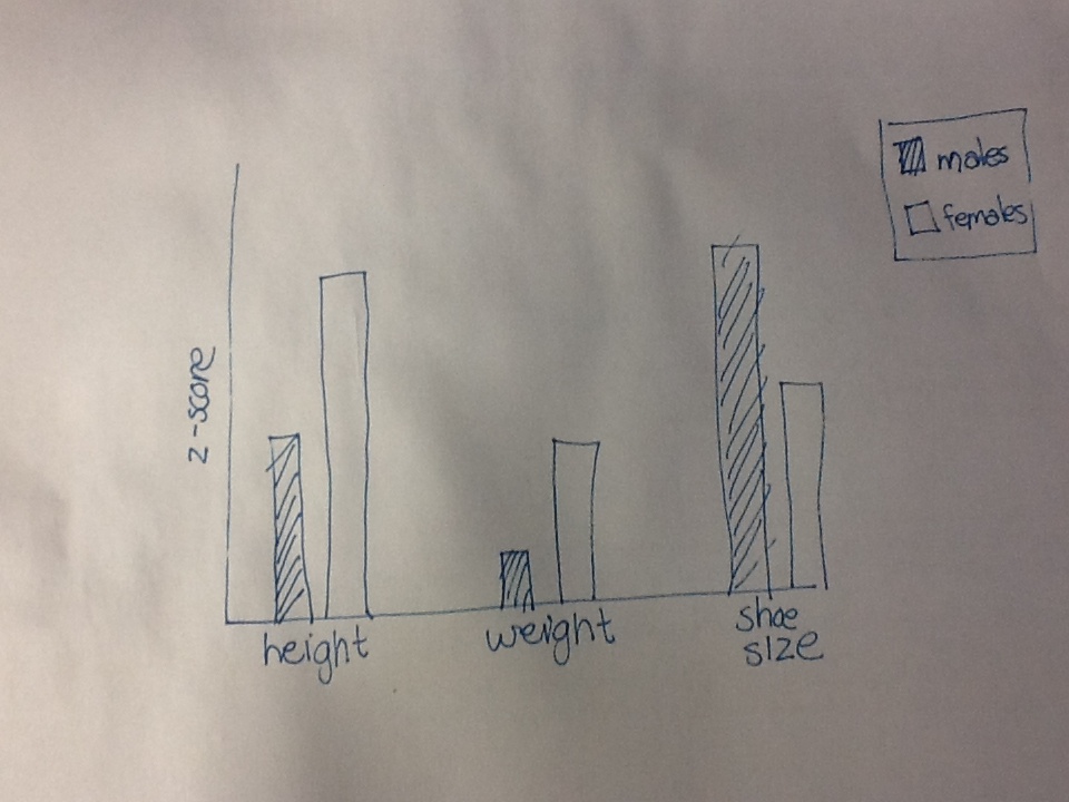
This is probably a really basic question, but I've been trying to sort out this graph for the last 2 hours and am stuck. I need a bar graph with different variables on the x axis (e.g. Height, weight, shoe size), their values on the y axis (they have been z-scored, so they are all the same), and each variable split into groups (e.g. Males and females). All I can get is the group membership on the x-axis and the 'groups' being the different variables. I've attached an image of what I want it to look like- help?? Thanks so much, Jillian 
|
|
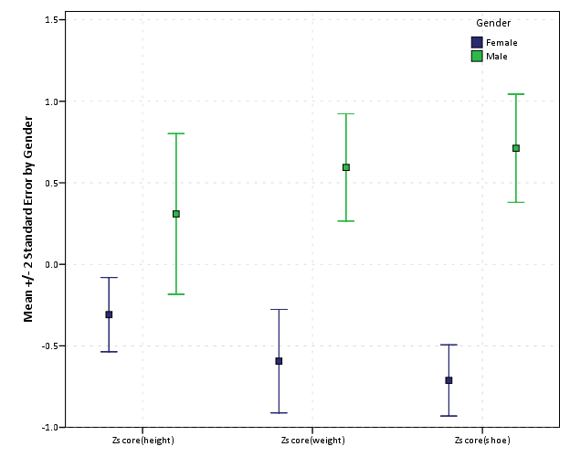
This is an example you can use the TRANSFORM specification with GGRAPH. Example below produces a bar chart, I also show an example making the inserted below error bar chart.
 ************************************************************************************************************************************. set seed 10. input program. loop #i = 1 to 25. loop #j = 1 to 2. compute gend = (#j EQ 1). end case. end loop. end loop. end file. end input program. dataset name gend. value labels gend 0 'Female' 1 'Male'. DO IF gend = 1. compute height = RV.NORMAL(68,3). compute weight = RV.NORMAL(170,15). compute shoe = RV.UNIFORM(6,12). ELSE. compute height = RV.NORMAL(65,3). compute weight = RV.NORMAL(140,15). compute shoe = RV.UNIFORM(4,8). END IF. *Zscoring variables. DESCRIPTIVES VARIABLES=height weight shoe /SAVE /STATISTICS=MEAN STDDEV MIN MAX . formats Zheight Zweight Zshoe (F2.1). *Making clustered bar chart using transform with orig data. dataset activate gend. GGRAPH /GRAPHDATASET NAME="graphdataset" VARIABLES= MEAN(Zheight) MEAN(Zweight) MEAN(Zshoe) gend TRANSFORM=VARSTOCASES(SUMMARY="MeanZ" INDEX ="vars") /GRAPHSPEC SOURCE=INLINE. BEGIN GPL SOURCE: s=userSource(id("graphdataset")) DATA: MeanZ=col(source(s), name("MeanZ")) DATA: vars=col(source(s), name("vars"), unit.category()) DATA: gend=col(source(s), name("gend"), unit.category()) COORD: rect(dim(1,2), cluster(3,0)) GUIDE: axis(dim(3), label("Variables")) GUIDE: axis(dim(2), label("Mean Zscore by Gender")) GUIDE: legend(aesthetic(aesthetic.color.interior), label("Gender")) SCALE: cat(dim(3)) SCALE: linear(dim(2), include(0)) SCALE: cat(aesthetic(aesthetic.color.interior)) SCALE: cat(dim(1)) ELEMENT: interval(position(gend*MeanZ*vars), color.interior(gend), shape.interior(shape.square)) END GPL. *Alternatives - see http://andrewpwheeler.wordpress.com/2012/02/20/avoid-dynamite-plots-visualizing-dot-plots-with-super-imposed-confidence-intervals-in-spss-and-r/. *And - http://andrewpwheeler.wordpress.com/2012/05/20/bean-plots-in-spss/. *A reasonable alternative is to make an error bar chart - inserting a guideline at zero would be a good idea as well. GGRAPH /GRAPHDATASET NAME="graphdataset" VARIABLES= MEANSE(Zheight,2) MEANSE(Zweight,2) MEANSE(Zshoe,2) gend TRANSFORM=VARSTOCASES(SUMMARY="MeanZ" INDEX ="vars" LOW="Low" HIGH="High") /GRAPHSPEC SOURCE=INLINE. BEGIN GPL SOURCE: s=userSource(id("graphdataset")) DATA: MeanZ=col(source(s), name("MeanZ")) DATA: Low=col(source(s), name("Low")) DATA: High=col(source(s), name("High")) DATA: vars=col(source(s), name("vars"), unit.category()) DATA: gend=col(source(s), name("gend"), unit.category()) COORD: rect(dim(1,2), cluster(3,0)) GUIDE: axis(dim(3)) GUIDE: axis(dim(2), label("Mean +/- 2 Standard Error by Gender")) GUIDE: legend(aesthetic(aesthetic.color.interior), label("Gender")) SCALE: cat(dim(3)) SCALE: linear(dim(2), include(0)) SCALE: cat(aesthetic(aesthetic.color.interior)) SCALE: cat(dim(1)) ELEMENT: interval(position(region.spread.range(gend*(Low+High)*vars)), color.interior(gend), shape(shape.ibeam)) ELEMENT: point(position(gend*MeanZ*vars), color.interior(gend), shape.interior(shape.square)) END GPL. ************************************************************************************************************************************. |
Re: Bar graph- variables as x axis, clustered by group membership?
|
That's exactly what I needed- thanks so much Andy!
Warm regards,
Jillian On Thu, Jul 25, 2013 at 6:39 AM, Andy W [via SPSSX Discussion] <[hidden email]> wrote: This is an example you can use the TRANSFORM specification with GGRAPH. Example below produces a bar chart, I also show an example making the inserted below error bar chart. |
«
Return to SPSSX Discussion
|
1 view|%1 views
| Free forum by Nabble | Edit this page |


