Chart editor for multiple line graph - reference line appears as a small circle instead of a line


|
Hello,
I'm hoping someone can help me with this. I'm creating graphs with multiple lines. I've been adding a vertical reference line to each graph (to separate the phases of intervention A-B-A) without any issues until now. Instead of a line, a dot/circle appears instead of the line. Can anyone help me to figure out what I can do in the chart editor to switch the circle, to lines again? 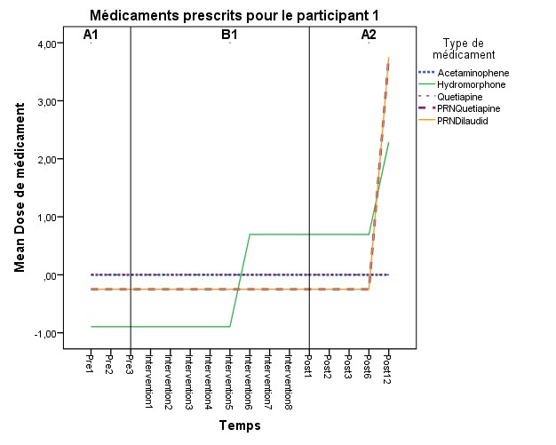 Thank you very much, Chantal 
|
|
|
Not sure about the behavior in the chart editor, but in syntax you can specify the guide line and its format. Example below - see the "GUIDE: form.line(" part.
**********************************************. *Fake data. INPUT PROGRAM. LOOP #T = 1 TO 12. LOOP #M = 1 TO 5. COMPUTE Temp = #T. COMPUTE Cat = #M. END CASE. END LOOP. END LOOP. END FILE. END INPUT PROGRAM. DATASET NAME Sim. COMPUTE Out = RV.UNIFORM(0,1). VARIABLE LEVEL Cat (NOMINAL) /Temp (ORDINAL). STRING TempA (A1). COMPUTE TempA = STRING(Temp+64,PIB). EXECUTE. *Now make the graph. GGRAPH /GRAPHDATASET NAME="graphdataset" VARIABLES=TempA MEAN(Out)[name="MEAN_Out"] Cat MISSING=LISTWISE REPORTMISSING=NO /GRAPHSPEC SOURCE=INLINE. BEGIN GPL SOURCE: s=userSource(id("graphdataset")) DATA: TempA=col(source(s), name("TempA"), unit.category()) DATA: MEAN_Out=col(source(s), name("MEAN_Out")) DATA: Cat=col(source(s), name("Cat"), unit.category()) GUIDE: axis(dim(1), label("Temp")) GUIDE: axis(dim(2), label("Mean Out")) GUIDE: legend(aesthetic(aesthetic.color.interior), label("Cat")) GUIDE: form.line(position("C",*), color(color.red), size(size."3")) SCALE: linear(dim(2), include(0)) ELEMENT: line(position(TempA*MEAN_Out), color.interior(Cat), missing.wings()) END GPL. **********************************************. |
Re: Chart editor for multiple line graph - reference line appears as a small circle instead of a line
|
Administrator
|
*Fake data *.
MATRIX. SAVE {KRONEKER(T({1:12}),MAKE(5,1,1)), KRONEKER(MAKE(12,1,1),T({1:5}))} /OUTFILE * / VARIABLES Temp Cat. END MATRIX. Nudge Nudge ;-)) --
Please reply to the list and not to my personal email.
Those desiring my consulting or training services please feel free to email me. --- "Nolite dare sanctum canibus neque mittatis margaritas vestras ante porcos ne forte conculcent eas pedibus suis." Cum es damnatorum possederunt porcos iens ut salire off sanguinum cliff in abyssum?" |
|
|
Ok, Ok, I'll save that example. It is more about memorization than key strokes - I have the INPUT PROGRAM and LOOPs memorized. MATRIX and Kroneker products not so much (I always misspell Krone{c}ker!)
|
Re: Chart editor for multiple line graph - reference line appears as a small circle instead of a line
|
Administrator
|
Just stick it in a macro and save in a library which you can INSERT at beginning of session.
DEFINE !Grid (!POS !TOKENS(1) / !POS !TOKENS(1) / !POS !CMDEND) MATRIX. SAVE {KRONEKER(T({1:!1}),MAKE(!2,1,1)), KRONEKER(MAKE(!1,1,1),T({1:!2}))}/OUTFILE * / VARIABLES !3 . END MATRIX. !ENDDEFINE . !Grid 12 5 Temp Cat .
Please reply to the list and not to my personal email.
Those desiring my consulting or training services please feel free to email me. --- "Nolite dare sanctum canibus neque mittatis margaritas vestras ante porcos ne forte conculcent eas pedibus suis." Cum es damnatorum possederunt porcos iens ut salire off sanguinum cliff in abyssum?" |
|
|
In reply to this post by Andy W
Or just use the File > Open > Data with Cases custom dialog available from the website On Thu, Dec 31, 2015 at 12:28 PM, Andy W <[hidden email]> wrote: Ok, Ok, I'll save that example. It is more about memorization than key |
|
|
In reply to this post by David Marso
Hey!
You guys are really nice to respond to my question so quickly, and on New Year'S Eve! I don't know anything about computer programming, and writing a syntax command in SPSS is not my strength, clearly. I've tried using the commands you wrote for me, but I'm not sure where to put my data at some places. And this is why I'm doing my PhD in Clinical Psychology, not Experimental Psych.  I was able to produce a graph with the following syntax that Andy provided (graph image is below): GGRAPH /GRAPHDATASET NAME="graphdataset" VARIABLES=Temps MEAN(dose)[name="dose"] med MISSING=LISTWISE REPORTMISSING=NO /GRAPHSPEC SOURCE=INLINE. BEGIN GPL SOURCE: s=userSource(id("graphdataset")) DATA: Temps=col(source(s), name("Temps"), unit.category()) DATA: dose=col(source(s), name("dose")) DATA: med=col(source(s), name("med"), unit.category()) GUIDE: axis(dim(1), label("Temps")) GUIDE: axis(dim(2), label("dose")) GUIDE: legend(aesthetic(aesthetic.color.interior), label("med")) GUIDE: form.line(position("C",*), color(color.red), size(size."3")) SCALE: linear(dim(2), include(0)) ELEMENT: line(position(Temps*dose), color.interior(med), missing.wings()) END GPL. I based myself on a syntax the department statistician had made for my analysis: GGRAPH /GRAPHDATASET NAME="GraphDataset" VARIABLES= Temps dose med /GRAPHSPEC SOURCE=INLINE. BEGIN GPL SOURCE: s=userSource( id( "GraphDataset" ) ) DATA: Temps=col( source(s), name( "Temps" ) ) DATA: dose=col( source(s), name( "dose" ) ) DATA: med = col(source(s), name("med"), unit.category()) GUIDE: axis(dim(1), ticks(null())) GUIDE: axis(dim(2), ticks(null())) ELEMENT: line( position(Temps*dose), shape(med)) ELEMENT: point( position(Temps * dose),color(med)) END GPL. But as for the preliminary syntax Andy suggested, I think i'm missing variables, or just not sure where to put them... INPUT PROGRAM. LOOP #T = 1 TO 16. LOOP #M = 1 TO 5. COMPUTE Temps = #T. COMPUTE med = #M. COMPUTE dose = #D END CASE. END LOOP. END LOOP. END FILE. END INPUT PROGRAM. DATASET NAME Sim. COMPUTE med = RV.UNIFORM(0,1). VARIABLE LEVEL med (NOMINAL) /Temps (ORDINAL). STRING Temps (A1). COMPUTE Temps = STRING(Temps+64,PIB). EXECUTE. Also tried this from David, and I'm not sure what I'm doing... 
MATRIX. SAVE {KRONEKER(T({1:16}),MAKE(5,1,1)), KRONEKER(MAKE(16,1,1),T({1:5}))} /OUTFILE * / VARIABLES Temps med dose. END MATRIX. My variable "Temps" means the 16 weeks of data collection (16 weeks in total). "dose" means the dose of medication prescribed to the participant. "med" means the type of medication (5 meds in total for participant #2, for whom I'm having trouble adding the references lines to his diagram). The doses were transformed in Z scores because there was too much variability in mg. In the graph, you can see only one line, because there all 5 are on top of one another (there was no variability in meds over the 16 weeks). 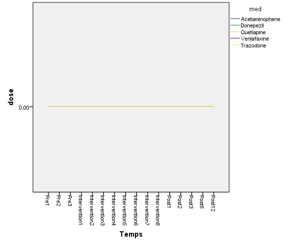 Anyhow, If you have clues to help me put the right info at the right places, to add the reference lines, or have questions for me (to help you help me), you are more than welcome. Thank you, happy New Year to all of you! Chantal |
|
|
The first part of the syntax only generates data to demonstrate the graph, as you did not provide any test data.
It seems like you want one graph per patient, and problem arises when you have overlapping data lines. Have you considered using row panels to show the medicines to avoid overlap? Here are two more elaborate examples, heavily changed in the GPL code. Initial code generates two subjects, data #1 eyeballed from your graph and #2 with all data set to 0. I frequently add white space to the syntax to enhance readability (and editing). The Phase label was inspired by Andy Wheeler's article: https://andrewpwheeler.wordpress.com/2015/01/14/labeling-tricks-in-spss-plots/ HTH, PRogman *------------------------------------------------------------------------------------------------------------. DATASET CLOSE ALL. *[Create data to demonstrate graph]*************************************************. *Use David Marso's macro; changed MAKE to initialize values to 0*. DEFINE !Grid (!POS !TOKENS(1) / !POS !TOKENS(1) / !POS !CMDEND) MATRIX. SAVE {KRONEKER(T({1:!1}),MAKE(!2,1,0)), KRONEKER(MAKE(!1,1,0),T({1:!2}))} /OUTFILE * /VARIABLES !3 . END MATRIX. !ENDDEFINE . !Grid 16 5 Temps Med . COMPUTE Id = 1. *Place ID first in file*. MATCH FILES FILE * /KEEP ID ALL. NUMERIC Dose (F6.2). * Get approximate data from posted graph *. IF (Med EQ 1) Dose = 0. DO IF (Med EQ 2). IF (Temps LE 8) Dose = -0.8 . IF (Temps GE 9) Dose = 0.8 . IF (Temps EQ 16) Dose = 2.4 . END IF. IF (Med EQ 3) Dose = 0. DO IF (Med EQ 4). COMPUTE Dose = -0.3 . IF (Temps EQ 16) Dose = 3.7 . END IF. DO IF (Med EQ 5). COMPUTE Dose = -0.3 . IF (Temps EQ 16) Dose = 3.7 . END IF. DATASET NAME TestData. *Copy data to make 2 subjects*. DATASET COPY ID2. DATASET ACTIVATE ID2. COMPUTE Id = 2. COMPUTE Dose = 0. EXECUTE. DATASET ACTIVATE TestData. ADD FILES FILE= * /FILE=ID2. EXECUTE. DATASET CLOSE ID2. VARIABLE LABELS Id 'Partipicient' Temps '' Med 'Type de médicament' Dose 'Dose de médicament' . VALUE LABELS Med 1 'Acetaminophen' 2 'Hydromorphone' 3 'Quetapine' 4 'PRNQuetapine' 5 'PRNDilaudid' /Temps 1 'Pre1' 2 'Pre2' 3 'Pre3' 4 'Intervention1' 5 'Intervention2' 6 'Intervention3' 7 'Intervention4' 8 'Intervention5' 9 'Intervention6' 10 'Intervention7' 11 'Intervention8' 12 'Post1' 13 'Post2' 14 'Post3' 15 'Post6' 16 'Post12' . * Data generation and labelling finished *. *[Test dataset ready]****************************************************************************. * Generate Phase labels. NUMERIC PhaseY (F6). * Set PhaseY label placement on y-axis in graph *. COMPUTE PhaseY = 3.8. * Generate Labels centered on appropriate 'Temps' position, and only on Med=1*. STRING PhaseLbl (A2). COMPUTE PhaseLbl = "" . IF ((Temps EQ 2) AND (Med EQ 1)) PhaseLbl = 'A1'. IF ((Temps EQ 7) AND (Med EQ 1)) PhaseLbl = 'B1'. IF ((Temps EQ 14) AND (Med EQ 1)) PhaseLbl = 'A2'. EXECUTE. ***********************************************************. *Dose format without decimals to make graphs clearer*. FORMATS Dose (F3.0). *Use split to get 1 graph per subject(?)*. SPLIT FILE BY Id. COMMENT >>I based myself on a syntax the department statistician had made for my analysis: The two ELEMENT commands uses the variable Med to control color and shape resulting in double legends. Also, this code does not calculate the mean dose, resulting in an unreadable graph if more than one patient is plotted . GGRAPH /GRAPHDATASET NAME="GraphDataset" VARIABLES= Temps dose med /GRAPHSPEC SOURCE=INLINE. BEGIN GPL SOURCE: s=userSource(id("GraphDataset")) DATA: Temps=col(source(s), name("Temps")) DATA: dose =col(source(s), name("dose")) DATA: med =col(source(s), name("med"), unit.category()) GUIDE: axis(dim(1), ticks(null())) GUIDE: axis(dim(2), ticks(null())) ELEMENT: line( position(Temps*dose), shape(med)) ELEMENT: point( position(Temps*dose), color(med)) END GPL. COMMENT First example: multiline graph i singe panel. It is difficult to read when data overlap ; The inline template command formats data labels used for PhaseLbl. Here font size and font weight can be changed GUIDE: Form.line commands draw lightgray lines at defined places. Included a baseline at 0, as values are standardized The second GUIDE block contains all the labels in the graph The SCALE commands formats the axes (data range) and data points. The last two matches the values of the data to color and shape of the data lines The first ELEMENT command is the data lines. Transparency is used to enhance readability when lines overlap The second element command places the PhaseY labels . GGRAPH /GRAPHDATASET NAME="graphdataset" VARIABLES=Temps MEAN(Dose)[name="MEAN_Dose"] Med PhaseY PhaseLbl MISSING=VARIABLEWISE REPORTMISSING=YES /GRAPHSPEC SOURCE=INLINE INLINETEMPLATE = ['<addDataLabels colorByMarker="false" styleOnly="true">' + ' <style color="#000000" font-size="12pt" font-style="regular" font-weight="bold" number="0" padding="2px" stroke-width="0.5pt" text-fit="true" visible="visible"/>' + ' <style color="transparent" color2="transparent" coordinate="1" number="1" visible="true"/>' + '</addDataLabels>' ]. BEGIN GPL SOURCE: s=userSource(id("graphdataset")) DATA: Temps =col(source(s), name("Temps"), unit.category()) DATA: MEAN_Dose=col(source(s), name("MEAN_Dose")) DATA: Med =col(source(s), name("Med"), unit.category()) DATA: PhaseY =col(source(s), name("Phase")) DATA: PhaseLbl =col(source(s), name("PhaseLbl"), unit.category()) GUIDE: form.line(position( *,0), color(color.lightgray), size(size."1")) GUIDE: form.line(position( 3,*), color(color.lightgray), size(size."1")) GUIDE: form.line(position(12,*), color(color.lightgray), size(size."1")) GUIDE: axis(dim(1), label("")) GUIDE: axis(dim(2), label("Mean Std Dose de médicament")) GUIDE: legend(aesthetic(aesthetic.color.interior), label("Type de médicament")) GUIDE: text.title(label("Médicament prescrits")) SCALE: cat(dim(1), include("1", "2", "3", "4", "5", "6", "7", "8", "9", "10", "11", "12", "13", "14", "15", "16")) SCALE: linear(dim(2), include(0), min(-2), max(4)) SCALE: cat(aesthetic(aesthetic.color.interior) ,include("1", "2", "3", "4", "5") ,map(("1", color.blue) ,("2", color.green) ,("3", color.brown) ,("4", color.purple) ,("5", color.orange) ) ) SCALE: cat(aesthetic(aesthetic.shape) ,map(("1", shape.half_dash) ,("2", shape.solid) ,("3", shape.dash) ,("4", shape.dash_2x) ,("5", shape.solid) ) ) ELEMENT: line(position(Temps*MEAN_Dose) ,color.interior(Med) ,shape(Med) ,size(size."2pt") ,transparency(transparency."0.4") ,missing.wings() ) ELEMENT: polygon(position(Temps*Phase) ,label(PhaseLbl) ,size(size."0") ,transparency.exterior(transparency."1") ) END GPL. *Second example: Using row panels*. GGRAPH /GRAPHDATASET NAME="graphdataset" VARIABLES=Temps MEAN(Dose)[name="MEAN_Dose"] Med PhaseY PhaseLbl MISSING=VARIABLEWISE REPORTMISSING=YES /GRAPHSPEC SOURCE=INLINE INLINETEMPLATE = ['<addDataLabels colorByMarker="false" styleOnly="true">' + ' <style color="#000000" font-size="12pt" font-style="regular" font-weight="bold" number="0" padding="2px" stroke-width="0.5pt" text-fit="true" visible="visible"/>' + ' <style color="transparent" color2="transparent" coordinate="1" number="1" visible="true"/>' + '</addDataLabels>' ]. BEGIN GPL SOURCE: s=userSource(id("graphdataset")) DATA: Temps =col(source(s), name("Temps"), unit.category()) DATA: MEAN_Dose=col(source(s), name("MEAN_Dose")) DATA: Med =col(source(s), name("Med"), unit.category()) DATA: PhaseY =col(source(s), name("Phase")) DATA: PhaseLbl =col(source(s), name("PhaseLbl"), unit.category()) GUIDE: form.line(position( *,0), color(color.lightgray), size(size."1")) GUIDE: form.line(position( 3,*), color(color.lightgray), size(size."1")) GUIDE: form.line(position(12,*), color(color.lightgray), size(size."1")) GUIDE: text.title(label("Médicament prescritst")) GUIDE: axis(dim(1), label("")) GUIDE: axis(dim(2), label("")) GUIDE: axis(dim(4), label("Mean Std Dose de médicament")) SCALE: cat(dim(1), include("1", "2", "3", "4", "5", "6", "7", "8", "9", "10", "11", "12", "13", "14", "15", "16")) SCALE: linear(dim(2), include(0), min(-2), max(4)) SCALE: cat(dim(4), include("1", "2", "3", "4", "5")) ELEMENT: line(position(Temps*MEAN_Dose*1*Med) ,missing.wings() ) ELEMENT: polygon(position(Temps*Phase*1*Med) ,label(PhaseLbl) ,size(size."0") ,transparency.exterior(transparency."1") ) END GPL. SPLIT FILE OFF. *------------------------------------------------------------------------------------------------------------.
|
«
Return to SPSSX Discussion
|
1 view|%1 views
| Free forum by Nabble | Edit this page |