Data Analysis Over Time: GGraph - Spaghetti Plots & Fit Line
Data Analysis Over Time: GGraph - Spaghetti Plots & Fit Line
|
Dear All,
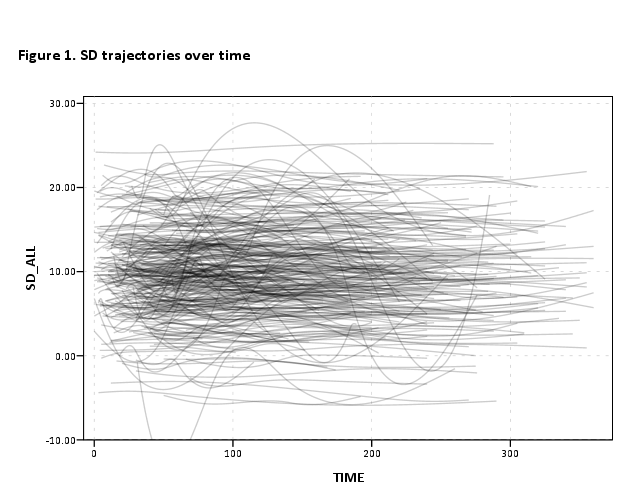
I need your help! :) I have a dataset that is consisted of 300 patients x 5 visits over a 12 month period. I have three subgroups within this dataset and I am trying to produce a spaghetti plot for each one of this groups and fit a line to this plots. Now, what I have done up to now is: 1. I was able to generate my spaghetti plots: GGRAPH /GRAPHDATASET NAME="GraphDataset" VARIABLES=TIME MEAN(SD_ALL)[name="MEAN_SD_ALL"] NewID[LEVEL=NOMINAL] MISSING=LISTWISE REPORTMISSING=NO /GRAPHSPEC SOURCE=INLINE . BEGIN GPL SOURCE: s=userSource( id( "GraphDataset")) DATA: MEAN_SD_ALL=col( source(s), name( "MEAN_SD_ALL" ) ) DATA: TIME=col( source(s), name( "TIME" ) ) DATA: NewID=col( source(s), name( "NewID" ), unit.category() ) GUIDE: text.title( label( "Figure 1. SD trajectories over time" ) ) GUIDE: axis( dim( 1 ), label( "TIME" ) ) GUIDE: axis( dim( 2 ), label( "MEAN_SD_ALL" ) ) GUIDE: legend(aesthetic(aesthetic.color.interior), label("NewID")) SCALE: linear(dim(2), include(0)) ELEMENT: line(position ( smooth.spline(summary.mean( TIME*MEAN_SD_ALL) ) ), shape.interior( NewID ))), color.interior( NewID )) ELEMENT: line( position( summary.mean( TIME*MEAN_SD_ALL ) ), transparency.interior(transparency."1.0") ) END GPL. 2. I have tried to fit a line. I have used a 'unique' subject ID which would correspond to the values of my dependent variable as derived from my calculations using excel and a cubic equation(if that makes sense). My thinking was to add a subject ID in my dataset whose values would correspond to the fit line. So, I adjusted my syntax: GGRAPH /GRAPHDATASET NAME="GraphDataset" VARIABLES=TIME P_400 MEAN(SD_ALL)[name="MEAN_SD_ALL"] NewID[LEVEL=NOMINAL] MISSING=LISTWISE REPORTMISSING=NO /GRAPHSPEC SOURCE=INLINE . BEGIN GPL SOURCE: s=userSource( id( "GraphDataset")) DATA: MEAN_SD_ALL=col( source(s), name( "MEAN_SD_ALL" ) ) DATA: TIME=col( source(s), name( "TIME" ) ) DATA: NewID=col( source(s), name( "NewID" ), unit.category() ) DATA: P_400=col( source(s), name( "NewID_400" ), unit.category() ) GUIDE: text.title( label( "Figure 1. SD trajectories over time" ) ) GUIDE: axis( dim( 1 ), label( "TIME" ) ) GUIDE: axis( dim( 2 ), label( "MEAN_SD_ALL" ) ) GUIDE: legend( aesthetic( aesthetic.shape.interior ), null() ) GUIDE: legend(aesthetic(aesthetic.color.interior), label("NewID")) ELEMENT: line(position ( smooth.spline(summary.mean( TIME*MEAN_SD_ALL) ) ), color(P_400))) ELEMENT: line(position(TIME*MEAN_SD_ALL)), color.interior(NewID), missing.wings()) END GPL. But.. instead of getting my nice spaghetti plot WITH this unique subject, I am getting only the regression line for subject P_400! As I have seen this done by a colleague with an older SPSS version, I am pretty sure it can be done. However, I don't understand what I am doing wrong 
..and I was thinking that someone could have an idea? Or, could indicate an easier way to produce a spaghetti plot with a fit line?Spaghetti_plot(1).JPGSpaghetti_plot(...)..JPG I (think) have uploaded my spaghetti plots in case it is not clear what I am trying to do.. Thank you for your time! Penny |
|
You have a slightly confusing mix of aggregate functions in your GGRAPH statement when you say you want the individual lines. Note that to use the aggregate functions within GPL you need to have categorical data (e.g. you can't have the measurement times at different days within the year). If that isn't the case, you can fit an equation outside of GGRAPH and superimpose the predictions on the plot.
Below is an example of plotting all individual lines using the split modifier. I also add a heavy dose of transparency to the lines. See the other smooth.* functions in the GGRAPH manual (e.g. you can fit a cubic equation with the original data directly in GPL - not sure if that is a good idea with only 5 time points though). You need to provide your data to say why the second graph only produces two lines. My guess it is a dummy variable for that one subject and it is producing two mean lines, one for the P400 case and another for all other cases in the dataset. Looking at the code it should return an error and not plot anything; there is an error referencing P_400 in the DATA statement to a variable that isn't passed on the GRAPHDATASET statement. *******************************************. set seed 10. input program. loop #i = 1 to 300. compute #mean = RV.NORMAL(0,5). compute #trend = RV.NORMAL(0,1). loop #j = 1 to 5. compute NewID = #i. compute TIME = #j*TRUNC(RV.UNIFORM(0,365/5)). compute SD_ALL = 10 + #mean + TIME/365*#trend + RV.NORMAL(0,.5). end case. end loop. end loop. end file. end input program. dataset name patients. sort cases by NewID TIME. variable level TIME (scale) NewID (nominal). formats TIME (F1.0) NewID (F3.0). *Individual lines. GGRAPH /GRAPHDATASET NAME="GraphDataset" VARIABLES=TIME SD_ALL NewID /GRAPHSPEC SOURCE=INLINE. BEGIN GPL SOURCE: s=userSource(id("GraphDataset")) DATA: SD_ALL=col(source(s),name("SD_ALL")) DATA: TIME=col(source(s),name("TIME")) DATA: NewID=col(source(s),name("NewID"),unit.category()) GUIDE: text.title(label("Figure 1. SD trajectories over time")) GUIDE: axis(dim(1),label("TIME")) GUIDE: axis(dim(2),label("SD_ALL")) SCALE: linear(dim(1), min(0), max(366)) SCALE: linear(dim(2)) ELEMENT: line(position(smooth.spline(TIME*SD_ALL)),split(NewID),transparency(transparency."0.8"),color(color.black)) END GPL. *******************************************. 
|
«
Return to SPSSX Discussion
|
1 view|%1 views
| Free forum by Nabble | Edit this page |

