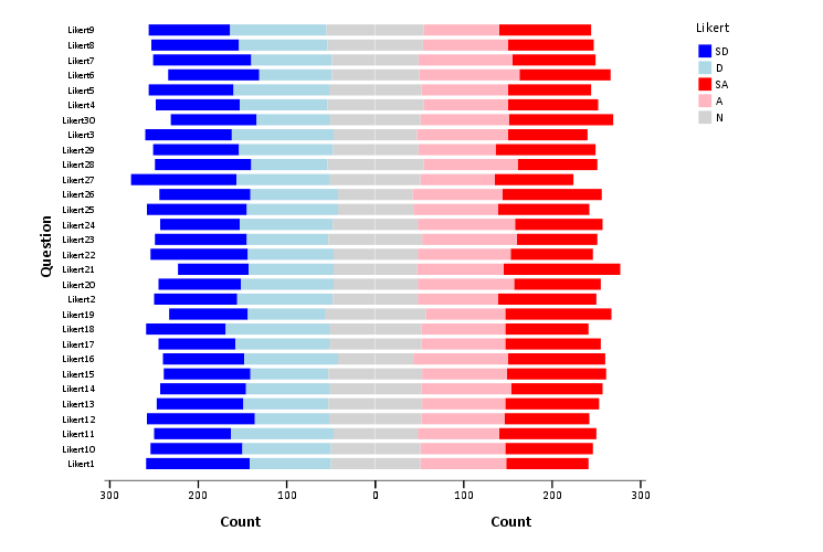
It is not possible. What the problem is is that with "interval.stack" it has to be the category on the first axis and what gets stacked on the second. So to create the horizontal stacked bar chart you need to transpose the chart, instead of just building it the opposite way to begin with.
It would be nice if "element.stack" had an option to switch these. I've complained about it before for dot plots as well.
The legend gets even more messed up if you do fancier things with likert graphs, see
https://andrewpwheeler.wordpress.com/2013/10/21/stacked-pyramid-bar-charts-for-likert-data/ for an example. To solve that though would take a more general engine to manipulate the legend.
I've never been able to get legends in chart templates to behave properly, so if I'm not happy with a chart I will export it to PDF and then edit it in Inkscape. I don't have to do that very often though fortunately.
