Graph problem


|
I’m having trouble producing a line graph in which the X axis is date/time in dd-mmm-yyyy hh:mm format (but ddd hh:mm would suffice) and the Y axis is the actual value (f3.0) of a single numeric variable at that moment in time. I also need the same graph with up to three different variables plotted. Graphs >> Chartbuilder won’t display PASTE and OK won’t progress. The nearest I’ve got so far is: Graphs >> Regression variable plots STATS REGRESS PLOT YVARS=Sys dia pulse XVARS=date /OPTIONS CATEGORICAL=BARS GROUP=1 BOXPLOTS INDENT=15 YSCALE=75 /FITLINES APPLYTO=TOTAL. How do I get lines? Thanks in advance John F Hall (Mr) [Retired academic survey researcher] Email: [hidden email] Website: www.surveyresearch.weebly.com SPSS start page: www.surveyresearch.weebly.com/1-survey-analysis-workshop |
|
|
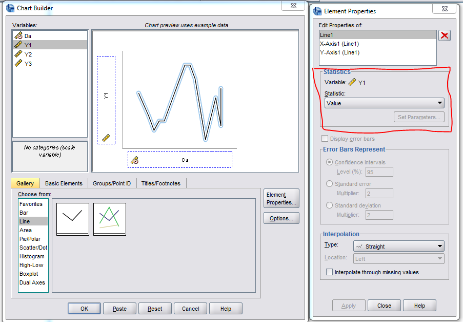
I think I know what you mean John. When you go through the graph builder, it oftens defaults to aggregating values when you pull them into the chart preview area. You can change that aggregation by selecting "Value" in the element properties box, as opposed to mean, sum, count, etc.
 Here is some example code superimposing multiple lines onto the same graph. *****************************************************************. DATA LIST FREE / Da (DATETIME17) Y1 TO Y3 (3F1.0). BEGIN DATA "25-May-1994 00:27" 1 2 3 "25-May-1994 00:28" 2 3 4 "25-May-1994 00:29" 3 4 5 "25-May-1994 00:30" 4 5 6 END DATA. DATASET NAME Times. VARIABLE LEVEL Y1 TO Y3 (SCALE). *Pasted code. GGRAPH /GRAPHDATASET NAME="graphdataset" VARIABLES=Da Y1 MISSING=LISTWISE REPORTMISSING=NO /GRAPHSPEC SOURCE=INLINE. BEGIN GPL SOURCE: s=userSource(id("graphdataset")) DATA: Da=col(source(s), name("Da")) DATA: Y1=col(source(s), name("Y1")) GUIDE: axis(dim(1), label("Da")) GUIDE: axis(dim(2), label("Y1")) ELEMENT: line(position(Da*Y1), missing.wings()) END GPL. *Update to have three variables. GGRAPH /GRAPHDATASET NAME="graphdataset" VARIABLES=Da Y1 Y2 Y3 MISSING=LISTWISE REPORTMISSING=NO /GRAPHSPEC SOURCE=INLINE. BEGIN GPL SOURCE: s=userSource(id("graphdataset")) DATA: Da=col(source(s), name("Da")) DATA: Y1=col(source(s), name("Y1")) DATA: Y2=col(source(s), name("Y2")) DATA: Y3=col(source(s), name("Y3")) GUIDE: axis(dim(1), label("Da")) GUIDE: axis(dim(2), label("Y1")) ELEMENT: line(position(Da*Y1), missing.wings()) ELEMENT: line(position(Da*Y2), missing.wings()) ELEMENT: line(position(Da*Y3), missing.wings()) END GPL. *****************************************************************. |
|
|
Andy Many thanks for this. Modified your syntax with my variables (systolic, diastolic and pulse) and got perfect graphs. GGRAPH /GRAPHDATASET NAME="graphdataset" VARIABLES=Date sys dia pulse MISSING=LISTWISE REPORTMISSING=NO /GRAPHSPEC SOURCE=INLINE. BEGIN GPL SOURCE: s=userSource(id("graphdataset")) DATA: Date =col(source(s), name("Date")) DATA: sys =col(source(s), name("sys")) DATA: dia=col(source(s), name("dia")) DATA: pulse=col(source(s), name("pulse")) GUIDE: axis(dim(1), label("Date")) GUIDE: axis(dim(2), label("sys dia pulse")) ELEMENT: line(position(Date*sys), missing.wings()) ELEMENT: line(position(Date*dia), missing.wings()) ELEMENT: line(position(Date*pulse), missing.wings()) END GPL. Bonne Année and Tous mes voeux as they say over here. John John F Hall (Mr) [Retired academic survey researcher] Email: [hidden email] Website: www.surveyresearch.weebly.com SPSS start page: www.surveyresearch.weebly.com/1-survey-analysis-workshop -----Original Message----- I think I know what you mean John. When you go through the graph builder, it oftens defaults to aggregating values when you pull them into the chart preview area. You can change that aggregation by selecting "Value" in the element properties box, as opposed to mean, sum, count, etc. <http://spssx-discussion.1045642.n5.nabble.com/file/n5731294/Capture_ValueLine.png> Here is some example code superimposing multiple lines onto the same graph. *****************************************************************. DATA LIST FREE / Da (DATETIME17) Y1 TO Y3 (3F1.0). BEGIN DATA "25-May-1994 00:27" 1 2 3 "25-May-1994 00:28" 2 3 4 "25-May-1994 00:29" 3 4 5 "25-May-1994 00:30" 4 5 6 END DATA. DATASET NAME Times. VARIABLE LEVEL Y1 TO Y3 (SCALE). *Pasted code. GGRAPH /GRAPHDATASET NAME="graphdataset" VARIABLES=Da Y1 MISSING=LISTWISE REPORTMISSING=NO /GRAPHSPEC SOURCE=INLINE. BEGIN GPL SOURCE: s=userSource(id("graphdataset")) DATA: Da=col(source(s), name("Da")) DATA: Y1=col(source(s), name("Y1")) GUIDE: axis(dim(1), label("Da")) GUIDE: axis(dim(2), label("Y1")) ELEMENT: line(position(Da*Y1), missing.wings()) END GPL. *Update to have three variables. GGRAPH /GRAPHDATASET NAME="graphdataset" VARIABLES=Da Y1 Y2 Y3 MISSING=LISTWISE REPORTMISSING=NO /GRAPHSPEC SOURCE=INLINE. BEGIN GPL SOURCE: s=userSource(id("graphdataset")) DATA: Da=col(source(s), name("Da")) DATA: Y1=col(source(s), name("Y1")) DATA: Y2=col(source(s), name("Y2")) DATA: Y3=col(source(s), name("Y3")) GUIDE: axis(dim(1), label("Da")) GUIDE: axis(dim(2), label("Y1")) ELEMENT: line(position(Da*Y1), missing.wings()) ELEMENT: line(position(Da*Y2), missing.wings()) ELEMENT: line(position(Da*Y3), missing.wings()) END GPL. *****************************************************************. ----- Andy W http://andrewpwheeler.wordpress.com/ -- View this message in context: http://spssx-discussion.1045642.n5.nabble.com/Graph-problem-tp5731292p5731294.html Sent from the SPSSX Discussion mailing list archive at Nabble.com. ===================== To manage your subscription to SPSSX-L, send a message to [hidden email] (not to SPSSX-L), with no body text except the command. To leave the list, send the command SIGNOFF SPSSX-L For a list of commands to manage subscriptions, send the command INFO REFCARD |
|
|
In reply to this post by Andy W
See also thread [Dates from separate numeric vars] In his book The Structure of Psychological Well-being (Aldine, 1969) Norman Bradburn unexpectedly found that Positive Affect increased immediately following the Kennedy assassination, but I don’t know of any work which replicates findings like this. I wanted to run analyses on some affective measures on dates either side of major events such as earthquakes, terrorist attacks etc. The data set used was my 1975 Quality of Life in Britain survey, which included a replication of Norman Bradburn's Affect Balance Scale. After a great deal of help off-line from Andy Wheeler and following in-thread suggestions from Art Kendall and David Marso, I have arrived at solutions for: 1: Creating dates from separate numeric variables for month and day of month. 2: Creating mean values of selected variables for each day of interviewing 3: Creating charts displaying line graphs of means for each day. The eventual syntax was: compute Date= date.dmy(var617,var614,1975). formats date(adate10). *Create means for each day. AGGREGATE /BREAK=date /affposmean=MEAN(affpos) /affnegmean = mean (affneg) /affbalmean = mean (affbal). *Simple plots for each new variable. GRAPH /LINE(SIMPLE)=MEAN(affposmean) BY Date. GRAPH /LINE(SIMPLE)=MEAN(affnegmean) BY Date. GRAPH /LINE(SIMPLE)=MEAN(affbalmean) BY Date. *Plot all three on same graph: method 1. TSPLOT VARIABLES=affposmean affnegmean affbalmean /ID=date /NOLOG. *Plot all three on same graph: method 2 (Andy Wheeler). GGRAPH /GRAPHDATASET NAME="dataset" VARIABLES=Date affposmean affnegmean affbalmean MISSING=LISTWISE REPORTMISSING=NO /GRAPHSPEC SOURCE=INLINE. BEGIN GPL SOURCE: s=userSource(id("dataset")) DATA: Date =col(source(s), name("Date")) DATA: affposmean =col(source(s), name("affposmean")) DATA: affnegmean=col(source(s), name("affnegmean")) DATA: affbalmean=col(source(s), name("affbalmean")) GUIDE: axis(dim(1), label("Date")) GUIDE: axis(dim(2), label("affposmean affnegmean affbalmean")) ELEMENT: line(position(Date*affposmean), color ("affposmean"), missing.wings()) ELEMENT: line(position(Date*affnegmean), color ("affnegmean"), missing.wings()) ELEMENT: line(position(Date*affbalmean), color ("affbalmean"), missing.wings()) END GPL. Several GGRAPH attempts failed before I deleted a blank line before BEGIN GPL. For the undergraduates and beginners at whom my tutorials are aimed, and for whom there may be severe timetable constraints, GGRAPH seems too complex, but the resulting chart is clearer. Now that the idea works, I need to find data sets with much larger samples, in which fieldwork straddles major events, widely covered by international media, such as 9/11 or the Chilean mining disaster, and which use affective measures. Thanks again to Art and David, but especially to Andy. John F Hall (Mr) [Retired academic survey researcher] Email: [hidden email] Website: www.surveyresearch.weebly.com SPSS start page: www.surveyresearch.weebly.com/1-survey-analysis-workshop -----Original Message----- From: SPSSX(r) Discussion [mailto:[hidden email]] On Behalf Of Andy W Sent: 15 January 2016 14:10 To: [hidden email] Subject: Re: Graph problem I think I know what you mean John. When you go through the graph builder, it oftens defaults to aggregating values when you pull them into the chart preview area. You can change that aggregation by selecting "Value" in the element properties box, as opposed to mean, sum, count, etc. <http://spssx-discussion.1045642.n5.nabble.com/file/n5731294/Capture_ValueLine.png> Here is some example code superimposing multiple lines onto the same graph. *****************************************************************. DATA LIST FREE / Da (DATETIME17) Y1 TO Y3 (3F1.0). BEGIN DATA "25-May-1994 00:27" 1 2 3 "25-May-1994 00:28" 2 3 4 "25-May-1994 00:29" 3 4 5 "25-May-1994 00:30" 4 5 6 END DATA. DATASET NAME Times. VARIABLE LEVEL Y1 TO Y3 (SCALE). *Pasted code. GGRAPH /GRAPHDATASET NAME="graphdataset" VARIABLES=Da Y1 MISSING=LISTWISE REPORTMISSING=NO /GRAPHSPEC SOURCE=INLINE. BEGIN GPL SOURCE: s=userSource(id("graphdataset")) DATA: Da=col(source(s), name("Da")) DATA: Y1=col(source(s), name("Y1")) GUIDE: axis(dim(1), label("Da")) GUIDE: axis(dim(2), label("Y1")) ELEMENT: line(position(Da*Y1), missing.wings()) END GPL. *Update to have three variables. GGRAPH /GRAPHDATASET NAME="graphdataset" VARIABLES=Da Y1 Y2 Y3 MISSING=LISTWISE REPORTMISSING=NO /GRAPHSPEC SOURCE=INLINE. BEGIN GPL SOURCE: s=userSource(id("graphdataset")) DATA: Da=col(source(s), name("Da")) DATA: Y1=col(source(s), name("Y1")) DATA: Y2=col(source(s), name("Y2")) DATA: Y3=col(source(s), name("Y3")) GUIDE: axis(dim(1), label("Da")) GUIDE: axis(dim(2), label("Y1")) ELEMENT: line(position(Da*Y1), missing.wings()) ELEMENT: line(position(Da*Y2), missing.wings()) ELEMENT: line(position(Da*Y3), missing.wings()) END GPL. *****************************************************************. ----- Andy W http://andrewpwheeler.wordpress.com/ -- View this message in context: http://spssx-discussion.1045642.n5.nabble.com/Graph-problem-tp5731292p5731294.html Sent from the SPSSX Discussion mailing list archive at Nabble.com. ===================== To manage your subscription to SPSSX-L, send a message to [hidden email] (not to SPSSX-L), with no body text except the command. To leave the list, send the command SIGNOFF SPSSX-L For a list of commands to manage subscriptions, send the command INFO REFCARD |
|
|
In reply to this post by John F Hall
I've attached the output for my latest post to a Nabble posting.
|
| Free forum by Nabble | Edit this page |