How widespread are the bugs in SPSS charts / graphs
How widespread are the bugs in SPSS charts / graphs
|
This post was updated on .
[1] On a variety of Windows (7) computers, using either Version 22 or 23 of SPSS, I've encountered a pretty severe bug in how SPSS saves and re-opens charts. Upon saving then re-opening an output file, all category variables on an axis will sometimes have spontaneously converted from 'included' to 'excluded.' Additionally, if the user has invested time in manual placement of data labels, that work is apparently lost and unrecoverable. See screen shot at http://i.imgur.com/k5QFq3K.png In other instances the output file spontaneously develops an inability render the chart at all.
[2] For many versions of SPSS including the current one, unless the user wants to write code to correct it, the chart legend will be useless for monochromatic multi-line graph with line markers and error bars. See the example graph below, or at https://sites.google.com/site/spssbroken/ Has anyone else encountered these problems? 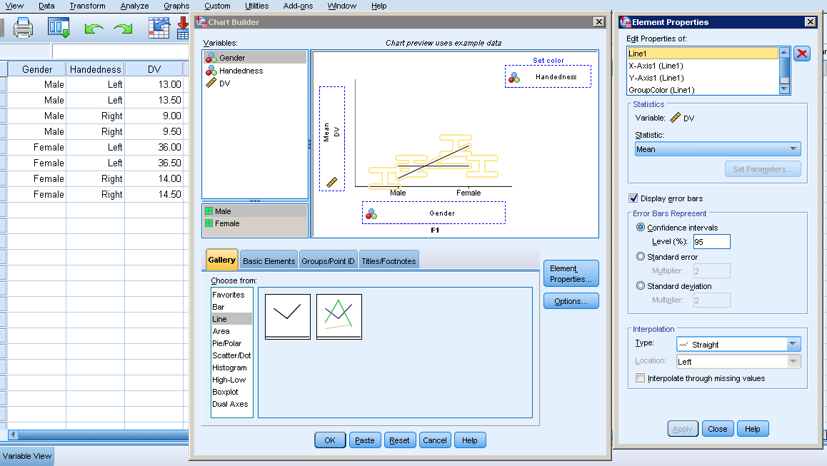 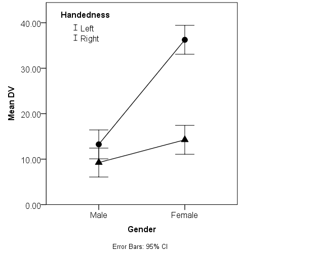
---------------------- Addendum 1/1/16 Note. The syntax that produces a line graph (without markers) is shown below. The GUI can be used to add line markers: Right-click the graph, Edit Content in Separate Window, Elements, Add Markers. However, the added markers do not appear in the legend, which makes the legend useless. To see the excluded categories, double-click the lines in the graph, then in the properties window, selected Categories. You will see that no categories are excluded. However, if you save the output file, then close SPSS, then re-open the output file, and you repeat that process several times, at some point the lines will disappear from the graph in the output file cause all of the categories are spontaneously moved to the 'excluded' category. (Also note that all these issues/bugs have indeed been reported to SPSS over the years.) * Chart Builder. GGRAPH /GRAPHDATASET NAME="graphdataset" VARIABLES=Gender MEANCI(DV, 95)[name="MEAN_DV" LOW="MEAN_DV_LOW" HIGH="MEAN_DV_HIGH"] Handedness MISSING=LISTWISE REPORTMISSING=NO /GRAPHSPEC SOURCE=INLINE. BEGIN GPL SOURCE: s=userSource(id("graphdataset")) DATA: Gender=col(source(s), name("Gender"), unit.category()) DATA: MEAN_DV=col(source(s), name("MEAN_DV")) DATA: Handedness=col(source(s), name("Handedness"), unit.category()) DATA: LOW=col(source(s), name("MEAN_DV_LOW")) DATA: HIGH=col(source(s), name("MEAN_DV_HIGH")) GUIDE: axis(dim(1), label("Gender")) GUIDE: axis(dim(2), label("Mean DV")) GUIDE: legend(aesthetic(aesthetic.color.interior), label("Handedness")) GUIDE: text.footnote(label("Error Bars: 95% CI")) SCALE: cat(dim(1), include("1.00", "2.00")) SCALE: linear(dim(2), include(0)) SCALE: cat(aesthetic(aesthetic.color.interior), include("1.00", "2.00")) ELEMENT: line(position(Gender*MEAN_DV), color.interior(Handedness), missing.wings()) ELEMENT: interval(position(region.spread.range(Gender*(LOW+HIGH))), shape.interior(shape.ibeam), color.interior(Handedness)) END GPL. |
|
What does "included" and "excluded" mean? If you have specific bugs to report you probably need to do it directly to SPSS.
For 2 I'm somewhat confused as well. Can you even make that chart through the GUI? Is it the result of some statistic function? |
Re: How widespread are the bugs in SPSS charts / graphs
|
Administrator
|
Indeed! Please provide the EXACT syntax or precise GUI walk through and steps in the editor you used to create this monster!
I doubt that anyone is going to spend time messing around trying to reproduce this without it.
Please reply to the list and not to my personal email.
Those desiring my consulting or training services please feel free to email me. --- "Nolite dare sanctum canibus neque mittatis margaritas vestras ante porcos ne forte conculcent eas pedibus suis." Cum es damnatorum possederunt porcos iens ut salire off sanguinum cliff in abyssum?" |
Re: How widespread are the bugs in SPSS charts / graphs
|
If you use the GUI please exit via <paste> so that you can post the exact syntax that you are using.
Art Kendall
Social Research Consultants |
Re: How widespread are the bugs in SPSS charts / graphs
|
This post was updated on .
Note. The syntax that produces a line graph (without markers) is shown below. The GUI can be used to add line markers: Right-click the graph, Edit Content in Separate Window, Elements, Add Markers. However, the added markers do not appear in the legend, which makes the legend useless.
To see the excluded categories, double-click the lines in the graph, then in the properties window, selected Categories. You will see that no categories are excluded. However, if you save the output file, then close SPSS, then re-open the output file, and you repeat that process several times, at some point the lines will disappear from the graph in the output file because all of the categories are spontaneously moved to the 'excluded' category. (Also note that all these issues/bugs have indeed been reported to SPSS over the years.) * Chart Builder. GGRAPH /GRAPHDATASET NAME="graphdataset" VARIABLES=Gender MEANCI(DV, 95)[name="MEAN_DV" LOW="MEAN_DV_LOW" HIGH="MEAN_DV_HIGH"] Handedness MISSING=LISTWISE REPORTMISSING=NO /GRAPHSPEC SOURCE=INLINE. BEGIN GPL SOURCE: s=userSource(id("graphdataset")) DATA: Gender=col(source(s), name("Gender"), unit.category()) DATA: MEAN_DV=col(source(s), name("MEAN_DV")) DATA: Handedness=col(source(s), name("Handedness"), unit.category()) DATA: LOW=col(source(s), name("MEAN_DV_LOW")) DATA: HIGH=col(source(s), name("MEAN_DV_HIGH")) GUIDE: axis(dim(1), label("Gender")) GUIDE: axis(dim(2), label("Mean DV")) GUIDE: legend(aesthetic(aesthetic.color.interior), label("Handedness")) GUIDE: text.footnote(label("Error Bars: 95% CI")) SCALE: cat(dim(1), include("1.00", "2.00")) SCALE: linear(dim(2), include(0)) SCALE: cat(aesthetic(aesthetic.color.interior), include("1.00", "2.00")) ELEMENT: line(position(Gender*MEAN_DV), color.interior(Handedness), missing.wings()) ELEMENT: interval(position(region.spread.range(Gender*(LOW+HIGH))), shape.interior(shape.ibeam), color.interior(Handedness)) END GPL. |
|
Ok, so to sum up your complaint for 2, when editing the chart interactively SPSS does not always update/add to the existing legend. Fair enough.
Your particular example though I find it strange to call it a bug. In your code you have Handedness mapped to a color - but in your screen shots they are changed to black. That is something *you* must of done somewhere. If you had kept colors the legend would still appropriately distinguish between the two lines via error bars of different colors. I can make a particular nonsense chart, it doesn't mean SPSS has a bug though. If you need it to be black/white, you could have edited one line to be grey and the other to be black just as easily as editing in the points and changing both to black. Below is example code to make a legend of the points. Also I changed the graph to cluster, which prevents the error bars from overlapping. I think drawing the lines between the two groups is kind of silly in this example, but that can easily be deleted. *************************************************. SET SEED 10. MATRIX. SAVE T({1:100}) /OUTFILE * /VARIABLES Id. END MATRIX. DATASET NAME Sim. COMPUTE Gender = RV.BERNOULLI(0.5). COMPUTE Handedness = RV.BERNOULLI(0.5). COMPUTE DV = 10 + 6*Gender + 23*Gender*Handedness + RV.NORMAL(0,10). RECODE Gender Handedness (0=1)(1=2). VALUE LABELS Gender 1 'Male' 2 'Female' /Handedness 1 'Left' 2 'Right'. EXECUTE. *clustering by handedness. GGRAPH /GRAPHDATASET NAME="graphdataset" VARIABLES=Gender MEANCI(DV, 95)[name="MEAN_DV" LOW="MEAN_DV_LOW" HIGH="MEAN_DV_HIGH"] Handedness MISSING=LISTWISE REPORTMISSING=NO /GRAPHSPEC SOURCE=INLINE. BEGIN GPL SOURCE: s=userSource(id("graphdataset")) DATA: Gender=col(source(s), name("Gender"), unit.category()) DATA: MEAN_DV=col(source(s), name("MEAN_DV")) DATA: Handedness=col(source(s), name("Handedness"), unit.category()) DATA: LOW=col(source(s), name("MEAN_DV_LOW")) DATA: HIGH=col(source(s), name("MEAN_DV_HIGH")) COORD: rect(dim(1,2), cluster(3,0)) GUIDE: axis(dim(3), label("Gender")) GUIDE: axis(dim(2), label("Mean DV")) GUIDE: legend(aesthetic(aesthetic.color.exterior), label("Handedness")) GUIDE: text.footnote(label("Error Bars: 95% CI")) SCALE: cat(dim(3), include("1.00", "2.00")) SCALE: linear(dim(2), include(0)) SCALE: cat(aesthetic(aesthetic.shape), map(("1.00",shape.circle),("2.00",shape.triangle))) SCALE: cat(dim(1), include("1.00", "2.00")) ELEMENT: line(position(Handedness*MEAN_DV*Gender), split(Handedness)) ELEMENT: interval(position(region.spread.range(Handedness*(LOW+HIGH)*Gender)), shape.interior(shape.line), split(Handedness)) ELEMENT: point(position(Handedness*MEAN_DV*Gender), shape(Handedness), color.interior(color.black), color.exterior(color.white), size(size."16")) END GPL. *************************************************. 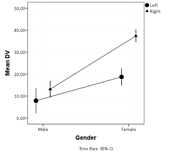 For 1, it is a bit too involved for me to even worry about reproducing. Note in syntax when SPSS defaults to placing "include" statements, e.g. " SCALE: cat(dim(1), include("1.00", "2.00"))", this does not exclude any actual data values. What is does is includes extra non-data category axis positions (or elements in a legend, such as a point marker). Imagine you had a Likert question with categories 1-5, but no one answered 2, you can put "include(2)" to have an empty slot for the 2 category. Another example would be if you had a scatterplot with three groups, and you made a point marker for each group. If say group 1 was a circle, but there were no group 1's in that dataset, if you include 1 it would still show up as a circle in the produced legend. Even if you don't have a category in the include statement, if it exists in the data it will be given a spot on the axis. So I'm not even sure how you inferred "converted from 'included' to 'excluded.'". This would literally mean some category not being in the chart anymore. Elements (such as points and lines) not rendering, which you show in your linked example, is something different. I imagine saving/opening the spv file can cause problems when people have different versions of SPSS. The simple answer is to export the images or the whole spv document to a different format. |
Re: How widespread are the bugs in SPSS charts / graphs
|
Thanks for responding:
(a) The corruption/loss of information upon reopening happens, when the opening and reopening is done within the same SPSS version. In point of fact, I just now opened the same graph without re-running any syntax or doing anything other than opening the output file, and I used the same version and installation of SPSS 23. The graph is now corrupted (see below). It is Including variable levels 1 and 2, AS WELL AS including the labels for those variable levels (male, female, left, right). The only way to fix it is to go to the Categories dialog box and EXCLUDE the "1" and "2." Sometimes levels spontaneously become Included when they shouldn't be, and sometimes spontaneously become Excluded when they shouldn't be. So this is an obviously broken aspect of SPSS and it has been broken at least since Version 22. 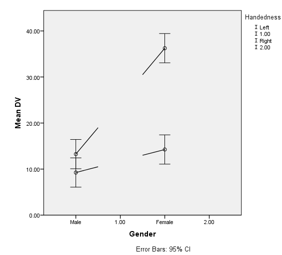 (b) Note that until very recently, and this is probably still the case case overall, the standard format for a graph in a scientific journal is black-and-white only (not gray) unless absolutely necessary. This is why it is important that the graph be black-and-white, and that the legend include markers. (c) Thanks for suggesting the scatter plot option as opposed to the line graph option. I actually do not see a way to remove the horizontal displacement feature so that the error bars DO overlap. (Sometimes, the X axis is plotting a quantitative rather than a categorical variable, and in such cases, one might greatly prefer NOT to be fudging the horizontal location of the data points.) If the include/exclude bug ever get's fixed (see A), it would be nice to explore the possibility of removing the horizontal fudging and allowing the error bars to overlap. A |
|
I am able to replicate this on V22 (without any fix packs installed). I will see if it persists next time I open V23.
These examples have to do with value labels. So initially when SPSS makes the chart, it knows to replace "1.00" with the corresponding value label, e.g. "Male". So when opening the spv file a second time, it appears to fill in the original numeric labels. You will have to provide another example where spontaneous excluding happens to replicate that behavior. Also this is a bit different than the original PNG you pointed to, in which the bars just disappear. I'm guessing if you use string data with the actual labels instead of numeric with value labels the problem won't continue. Again though we are not SPSS agents, reporting bugs to us that you have already reported is not likely to result in any action on IBM's part. We can show/suggest workarounds, like I already did, but we aren't tech support. ----- For the other stuff, for b) I have *never* come across a journal requesting strictly black and white. For c) it was intentional. You could make them not displaced on the x-axis, as in your original, but that is confusing. It is visually very hard to figure out the difference in the bars, and you can make examples where they would be entirely confounded. Note that the general rule of thumb, the one error bar needs to overlap the other *point estimate* to conclude the difference is statistically significant. When just the error bars overlap (which can easily be seen when the estimates are displaced) the difference is still frequently statistically significant. |
Re: How widespread are the bugs in SPSS charts / graphs
|
Thanks Andy W !,
I'm finding that avoiding variable-level labels does seem to avoid the chart-corruption problem. So that, together with needing to use scatter plot rather than line graph has gotten me a lot closer to being able to stay with SPSS for graphs. In fact, as long as I don't need a scale X axis for my scatter-plot version of graph-with-error bars, I think I'm OK. (The scale-X version produces whisker error bars even when set to produce I-type error bars, and connecting the the lines results in a whole bunch of irremovable garbage). 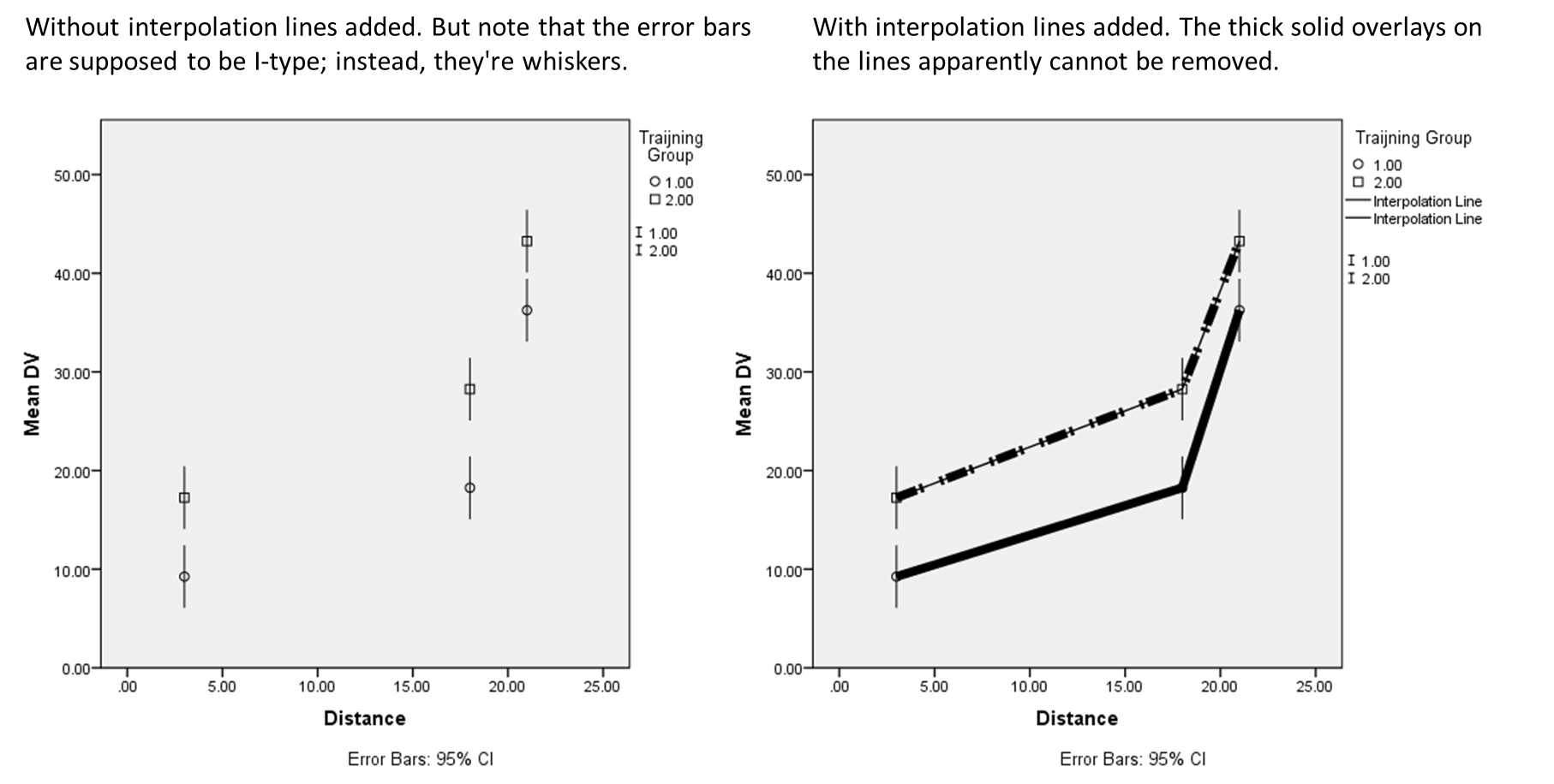 [Also FYI, the American Psychological Association's journals have the following rules for color graphs: "APA offers authors the option to publish their figures online in color without the costs associated with print publication of color figures. The same caption will appear on both the online (color) and print (black and white) versions. To ensure that the figure can be understood in both formats, authors should add alternative wording (e.g., "the red (dark gray) bars represent") as needed. For authors who prefer their figures to be published in color both in print and online, original color figures can be printed in color at the editor's and publisher's discretion PROVIDED THE AUTHOR AGREES TO PAY."] GGRAPH /GRAPHDATASET NAME="graphdataset" VARIABLES=Distance MEANCI(DV, 95)[name="MEAN_DV" LOW="MEAN_DV_LOW" HIGH="MEAN_DV_HIGH"] TrainingGroup MISSING=LISTWISE REPORTMISSING=NO /GRAPHSPEC SOURCE=INLINE. BEGIN GPL SOURCE: s=userSource(id("graphdataset")) DATA: Distance=col(source(s), name("Distance")) DATA: MEAN_DV=col(source(s), name("MEAN_DV")) DATA: TrainingGroup=col(source(s), name("TrainingGroup"), unit.category()) DATA: LOW=col(source(s), name("MEAN_DV_LOW")) DATA: HIGH=col(source(s), name("MEAN_DV_HIGH")) GUIDE: axis(dim(1), label("Distance")) GUIDE: axis(dim(2), label("Mean DV")) GUIDE: legend(aesthetic(aesthetic.color.exterior), label("Traijning Group")) GUIDE: text.footnote(label("Error Bars: 95% CI")) ELEMENT: point(position(Distance*MEAN_DV), color.exterior(TrainingGroup)) ELEMENT: interval(position(region.spread.range(Distance*(LOW+HIGH))), shape.interior(shape.ibeam), color.interior(TrainingGroup)) END GPL. |
|
When charts have a continuous x axis, interval elements have zero width (besides the outline). So they are I beams in the underlying vector code, but are so thin you can't see them. You can add "size(size."12")" to the GGRAPH code to see the cross beams for example. (I think the cross beams are almost always distracting IMO - visually overemphasize the end points as opposed to the point estimate.)
I don't know what your complaint about the lines is now. A generic answer is specify the elements you want in the chart in GGRAPH code, as opposed to putzing around with the GUI editor. There you can specify what the lines look like. In my previous example code see the "ELEMENT: line(" part. Your quoting the APA guidelines is my point - you can use greyscale changes (e.g. red -> dark grey) to differentiate between a small number of elements. You said "black-and-white only (not gray)" - which I have never seen a single example of. |
Re: How widespread are the bugs in SPSS charts / graphs
|
Thanks for the information concerning gray scale. (I do however recommend black and while, because shades of gray can look similar in print).
Certainly, coding the graphs is an alternative to using the GUI (though th GUI is perhaps SPSS's main asset, without which one might just use something like R). Thanks again. |
«
Return to SPSSX Discussion
|
1 view|%1 views
| Free forum by Nabble | Edit this page |

