Isolate/highlight a particular bar in chart
Isolate/highlight a particular bar in chart
|
I'm trying to highlight the bar which represent's the client brand and de-highlights all other brands/bars.
I use "employee data.sav" as a demo I first get to this : 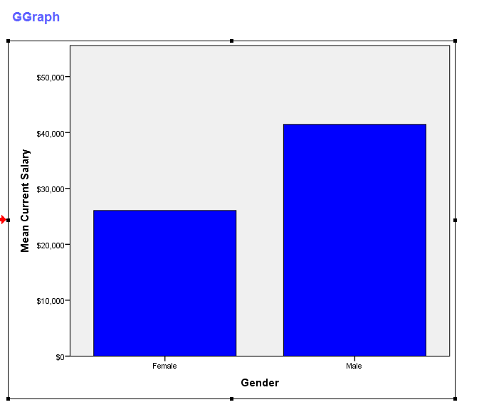 get file="C:\Program Files\IBM\SPSS\Statistics\22\Samples\English\Employee data.sav". * Chart Builder. GGRAPH /GRAPHDATASET NAME="graphdataset" VARIABLES=gender MEAN(salary)[name="MEAN_salary"] MISSING=LISTWISE REPORTMISSING=NO /GRAPHSPEC SOURCE=INLINE. BEGIN GPL SOURCE: s=userSource(id("graphdataset")) DATA: gender=col(source(s), name("gender"), unit.category()) DATA: MEAN_salary=col(source(s), name("MEAN_salary")) GUIDE: axis(dim(1), label("Gender")) GUIDE: axis(dim(2), label("Mean Current Salary")) SCALE: cat(dim(1), include("f", "m")) SCALE: linear(dim(2), include(0)) ELEMENT: interval(position(gender*MEAN_salary),color.interior(color.blue)) END GPL. But then when I update to try highlight female bar by increasing the transparency of males bar it doesn't result in the expected instead I get this: 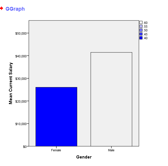 if gender="m" highlight=0.6. if gender="f" highlight=0.4. cro gender by highlight. * Chart Builder. GGRAPH /GRAPHDATASET NAME="graphdataset" VARIABLES=gender highlight MEAN(salary)[name="MEAN_salary"] MISSING=LISTWISE REPORTMISSING=NO /GRAPHSPEC SOURCE=INLINE. BEGIN GPL SOURCE: s=userSource(id("graphdataset")) DATA: gender=col(source(s), name("gender"), unit.category()) DATA: highlight=col(source(s), name("highlight")) DATA: MEAN_salary=col(source(s), name("MEAN_salary")) GUIDE: axis(dim(1), label("Gender")) GUIDE: axis(dim(2), label("Mean Current Salary")) SCALE: cat(dim(1), include("f", "m")) SCALE: linear(dim(2), include(0)) ELEMENT: interval(position(gender*MEAN_salary),color.interior(color.blue), transparency.interior(highlight)) END GPL. If however, I compute highlight variable to be equal (0.5) for both males and females then both bars are set to their transparency values accordingly. I can use the map feature which does work but I wanted to learn how to use variable inputs to change aesthetics. This works: * Chart Builder. GGRAPH /GRAPHDATASET NAME="graphdataset" VARIABLES=gender highlight MEAN(salary)[name="MEAN_salary"] MISSING=LISTWISE REPORTMISSING=NO /GRAPHSPEC SOURCE=INLINE. BEGIN GPL SOURCE: s=userSource(id("graphdataset")) DATA: gender=col(source(s), name("gender"), unit.category()) DATA: highlight=col(source(s), name("highlight")) DATA: MEAN_salary=col(source(s), name("MEAN_salary")) GUIDE: axis(dim(1), label("Gender")) GUIDE: axis(dim(2), label("Mean Current Salary")) SCALE: cat(dim(1), include("f", "m")) SCALE: linear(dim(2), include(0)) SCALE: cat(aesthetic(aesthetic.transparency), map(("m",transparency."0.2"), ("f", transparency."0.8"))) ELEMENT: interval(position(gender*MEAN_salary),color.interior(color.blue), transparency.interior(gender)) END GPL. Why is it behaving the way it is? What am I doing wrong? Many thanks in advance, Jignesh |
Re: Isolate/highlight a particular bar in chart
|
I figured this out by adding:
SCALE: linear(aesthetic(aesthetic.transparency.interior), aestheticMinimum(transparency."0.1"), aestheticMaximum(transparency."0.7")) Which I think then proportions the actual data values across the valid scale from transparency, which by default is zero to one. So the minimum value found in the variable highlight 0.4 is mapped to zero transparency and 1 in highlight is mapped to one in transparency. What if I wanted the transparency value to be the actual value in the data itself? |
|
Your very close, just specify "min(0)" and "max(1)" within the same scale statement and change the aesthetic anchors to 0 and 1 as well. Otherwise I'm pretty sure the min and max of the data are taken as the anchors by default. This makes a linear 1-to-1 mapping with the data and the transparency level.
Also I made it so the legend isn't generated. See below: if gender="m" highlight=0.9. if gender="f" highlight=0.2. GGRAPH /GRAPHDATASET NAME="graphdataset" VARIABLES=gender highlight MEAN(salary)[name="MEAN_salary"] MISSING=LISTWISE REPORTMISSING=NO /GRAPHSPEC SOURCE=INLINE. BEGIN GPL SOURCE: s=userSource(id("graphdataset")) DATA: gender=col(source(s), name("gender"), unit.category()) DATA: highlight=col(source(s), name("highlight")) DATA: MEAN_salary=col(source(s), name("MEAN_salary")) GUIDE: axis(dim(1), label("Gender")) GUIDE: axis(dim(2), label("Mean Current Salary")) GUIDE: legend(aesthetic(aesthetic.transparency), null()) SCALE: cat(dim(1), include("f", "m")) SCALE: linear(dim(2), include(0)) SCALE: linear(aesthetic(aesthetic.transparency.interior), aestheticMinimum(transparency."0"), aestheticMaximum(transparency."1"), min(0), max(1)) ELEMENT: interval(position(gender*MEAN_salary),color.interior(color.blue), transparency.interior(highlight)) END GPL. 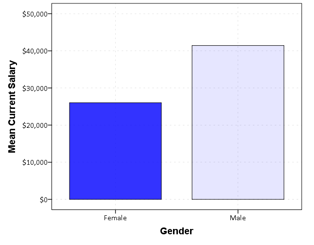
|
Re: Isolate/highlight a particular bar in chart
|
Thanks Andy, can the bar chart be flipped so the bar run horizontally?
|
|
You can simply add (in the inline GPL):
COORD: transpose() to get the bars to run horizontally. The other option would be to change the graph algebra, but that would require editing several parts of GPL syntax. |
Re: Isolate/highlight a particular bar in chart
|
Brilliant, thanks Andy.
My chart now looks a little something like this: 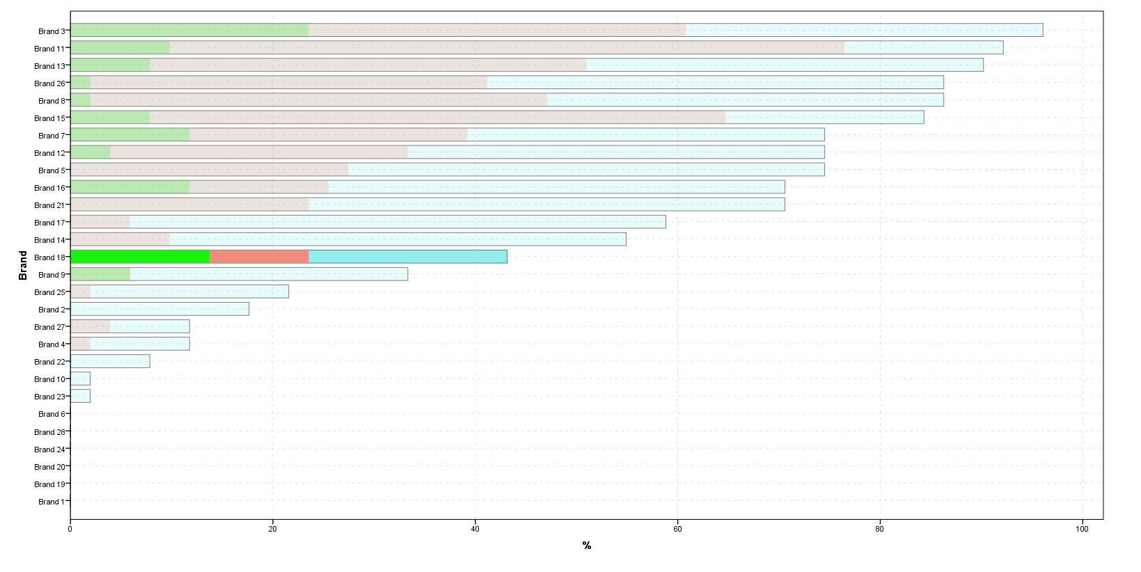 Which I generated using this i.e. overlaying 3 ELEMENTS each of different color. Is it possible to generate a legend entry for the 3 colors/elements? * Chart Builder. GGRAPH /GRAPHDATASET NAME="graphdataset" VARIABLES=Brand ClientBrand MEAN(Q2)[name="MEAN_Q2"] MEAN(Q3)[name="MEAN_Q3"] MEAN(Q4)[name="MEAN_Q4"] MISSING=LISTWISE REPORTMISSING=NO /GRAPHSPEC SOURCE=INLINE. BEGIN GPL PAGE: begin(scale(1600px,800px)) SOURCE: s=userSource(id("graphdataset")) COORD: transpose() DATA: Brand=col(source(s), name("Brand"), unit.category()) DATA: ClientBrand=col(source(s), name("ClientBrand")) DATA: MEAN_Q2=col(source(s), name("MEAN_Q2")) DATA: MEAN_Q3=col(source(s), name("MEAN_Q3")) DATA: MEAN_Q4=col(source(s), name("MEAN_Q4")) GUIDE: legend(aesthetic(aesthetic.transparency.interior), null()) GUIDE: axis(dim(1), label("Brand")) GUIDE: axis(dim(2), label("%")) SCALE: cat(dim(1), sort.statistic(summary.mean(MEAN_Q2))) SCALE: linear(aesthetic(aesthetic.transparency.interior), aestheticMinimum(transparency."0.1"), aestheticMaximum(transparency."0.8")) SCALE: linear(dim(2), include(0)) ELEMENT: interval(position(Brand*MEAN_Q2),color.interior(color.skyblue),transparency(ClientBrand),transparency.exterior(transparency."0.5"),color.hue(color.hue."0.5")) ELEMENT: interval(position(Brand*MEAN_Q3),color.interior(color.salmon),transparency(ClientBrand),transparency.exterior(transparency."1")) ELEMENT: interval(position(Brand*MEAN_Q4),color.interior(color.lime),transparency(ClientBrand),transparency.exterior(transparency."1")) PAGE: end() END GPL. Also when using transparency the middle color looses a lot of its color and makes it difficult to distinguish it as being the same color as the one highlighted for Brand 18. Is transparency the best way to go about acheviing something like this or are their other options? Or do I just need to play around with a lot of different colors ? |
|
That is a pretty crazy chart. Short answer about the legend is no, with that code you would only be able to generate a legend showing the transparency gradations -- delete "GUIDE: legend(aesthetic(aesthetic.transparency.interior), null()) " and see what happens.
If you reshaped the data you may be able to generate the same chart using stacked intervals, which would be able to get a closer legend, but it would still be two separate ones, one for color and another for transparency gradations. This chart I would use points instead of bars here, like this: I think the best advice I can give is to not superimpose the bars, but make a set of small multiple charts, with Brand being the panel. This chart I would use points instead of bars here, like this: 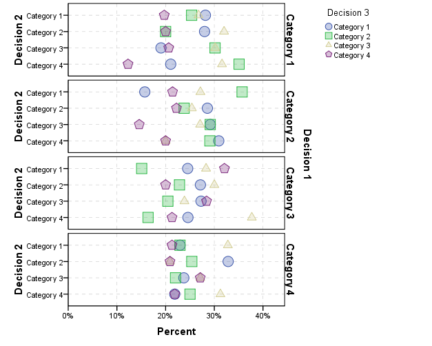 You can map the size and/or transparency to further emphasize particular points. |
«
Return to SPSSX Discussion
|
1 view|%1 views
| Free forum by Nabble | Edit this page |

