Legend problem when line graph includes error bars
Legend problem when line graph includes error bars
|
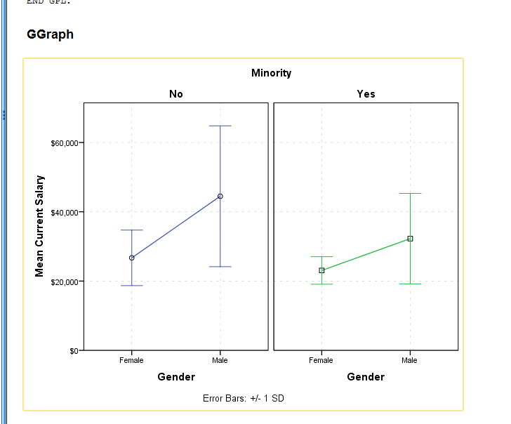
Has anyone else encountered (and circumvented) the problem of SPSS creating a useless legend when a line graph includes error bars? See https://sites.google.com/site/documentrepository1/spss-error-bars-complaint
|
Re: Legend problem when line graph includes error bars
|
Not entirely sure where the problem lies, partly because the graph you post isn't what the syntax you provide generates.
The syntax you provide doesn't plot the POINT ELEMENT as is shown in the graph you post and also the Minority elements are separated by color; blue (No)/green (Yes). Nonetheless, overlaying the error bars as you are probably isn't not ideal, particularly if they are both in black color (when colored differently, still isn't great). Perhaps paneling by Minority is a better option of presenting this data (and no need for any legends also?)? GGRAPH /GRAPHDATASET NAME="graphdataset" VARIABLES= gender minority MEANSD(salary, 1)[name="MEAN_salary" LOW="MEAN_salary_LOW" HIGH="MEAN_salary_HIGH"] MISSING=LISTWISE REPORTMISSING=NO /GRAPHSPEC SOURCE=INLINE. BEGIN GPL SOURCE: s=userSource(id("graphdataset")) DATA: gender=col(source(s), name("gender"), unit.category()) DATA: minority=col(source(s), name("minority"), unit.category()) DATA: MEAN_salary=col(source(s), name("MEAN_salary")) DATA: LOW=col(source(s), name("MEAN_salary_LOW")) DATA: HIGH=col(source(s), name("MEAN_salary_HIGH")) GUIDE: legend(aesthetic(aesthetic.color.interior), label("Minority Classification"), null()) GUIDE: legend(aesthetic(aesthetic.shape), null()) GUIDE: axis(dim(1), label("Gender")) GUIDE: axis(dim(2), label("Mean Current Salary")) GUIDE: axis(dim(3), label("Minority"), opposite()) GUIDE: text.footnote(label("Error Bars: +/- 1 SD")) SCALE: cat(dim(1), include("f", "m")) SCALE: linear(dim(2), include(0)) SCALE: cat(aesthetic(aesthetic.color.interior), include("0", "1")) ELEMENT: line(position(gender*MEAN_salary*minority), color.interior(minority), missing.wings()) ELEMENT: point(position(gender*MEAN_salary*minority), shape(minority)) ELEMENT: interval(position(region.spread.range(gender*(LOW+HIGH)*minority)), shape.interior(shape.ibeam), color.interior(minority)) END GPL.  I initially thought maybe perhaps jittering your original graph could over come the overlapping error bars but I couldn't get that to work, that could be an option if wanting it in a single graph without paneling but not entirely sure if its possible. Still not entirely sure about your comments with problems with the legend however, your question at hand. |
Re: Legend problem when line graph includes error bars
|
By the way, if you remove the two "null()" in the GUIDE: legend in the syntax I provided, does that give you what you were after? A legend for markers (point elements?)
You can adapt that into your syntax, if you still wanted to overlay the two into a single graph. |
Re: Legend problem when line graph includes error bars
|
In reply to this post by andersony3k
I agree it is annoying, but why are you using a line graph for data like these? A line graph implies a continuous trend, but your x-axis data and your grouping (obviously) both are categorical. Just use an error bar graph and you will get both different symbols and (undifferentiated) error bars in the legend. If your error bars are large enough to be distinguished by line pattern that can be fudged too, if you make the legend typeface large enough.
DATASET ACTIVATE DataSet1. * Chart Builder. GGRAPH /GRAPHDATASET NAME="graphdataset" VARIABLES=GeoSitu MEANCI(age, 95)[name="MEAN_age" LOW="MEAN_age_LOW" HIGH="MEAN_age_HIGH"] sex MISSING=LISTWISE REPORTMISSING=NO /GRAPHSPEC SOURCE=INLINE. BEGIN GPL SOURCE: s=userSource(id("graphdataset")) DATA: GeoSitu=col(source(s), name("GeoSitu"), unit.category()) DATA: MEAN_age=col(source(s), name("MEAN_age")) DATA: sex=col(source(s), name("sex"), unit.category()) DATA: LOW=col(source(s), name("MEAN_age_LOW")) DATA: HIGH=col(source(s), name("MEAN_age_HIGH")) COORD: rect(dim(1,2), cluster(3,0)) GUIDE: axis(dim(3), label("Geographic Location")) GUIDE: axis(dim(2), label("Mean Information sheet: Age (Validated)")) GUIDE: legend(aesthetic(aesthetic.color.exterior), label("Sex")) GUIDE: text.footnote(label("Error Bars: 95% CI")) SCALE: cat(dim(3), include("1", "2")) SCALE: linear(dim(2), include(0)) SCALE: cat(aesthetic(aesthetic.color.exterior), include("1", "2")) SCALE: cat(dim(1), include("1", "2")) ELEMENT: point(position(sex*MEAN_age*GeoSitu), color.exterior(sex)) ELEMENT: interval(position(region.spread.range(sex*(LOW+HIGH)*GeoSitu)), shape.interior(shape.ibeam), color.interior(sex)) END GPL. Ian D. Martin, Ph.D. Environmental Analysis & Consulting On Nov 27, 2014, at 12:44 PM, andersony3k <[hidden email]> wrote: > Has anyone else encountered (and circumvented) the problem of SPSS creating a > useless legend when a line graph includes error bars? See > https://sites.google.com/site/documentrepository1/spss-error-bars-complaint > > > > -- > View this message in context: http://spssx-discussion.1045642.n5.nabble.com/Legend-problem-when-line-graph-includes-error-bars-tp5728064.html > Sent from the SPSSX Discussion mailing list archive at Nabble.com. > > ===================== > To manage your subscription to SPSSX-L, send a message to > [hidden email] (not to SPSSX-L), with no body text except the > command. To leave the list, send the command > SIGNOFF SPSSX-L > For a list of commands to manage subscriptions, send the command > INFO REFCARD ===================== To manage your subscription to SPSSX-L, send a message to [hidden email] (not to SPSSX-L), with no body text except the command. To leave the list, send the command SIGNOFF SPSSX-L For a list of commands to manage subscriptions, send the command INFO REFCARD |
Re: Legend problem when line graph includes error bars
|
In reply to this post by andersony3k
Thanks for the replies so far. Note that I offer the graph simply as an illustration of the inadequacy of the legend. It is not real data. So while there are ways to plot the data differently to avoid using the line graph legend, sometimes one want to plot a multi-line graph. Regarding whether there is a mismatch between the graph and the syntax: The syntax is auto-generated from the Chart builder. I then had to manually change some elements, using the chart builder rather than syntax.
Also thanks for the syntax suggestions. However, I use SPSS because it works well for undergraduate teaching as well as for research, saves me from having to deal regularly with syntax that could interfere with the syntax I need to remember for various other languages and applications. It's nice to know there are was to use SPSS syntax to get around the problem. On the other hand, if we want to use syntax, we might as well use R. So I'm hoping there is a workaropund either in the Chart Builder, or that SPSS will fix the Chart Builder so that the user can insert line markers into the legend. |
«
Return to SPSSX Discussion
|
1 view|%1 views
| Free forum by Nabble | Edit this page |

