Location of legend
|
Data for example. data list list /id(f8.0) var1(f8.0) var2(f8.0). begin data. 1 1 1 2 1 1 3 2 1 4 3 1 5 3 5 6 3 6 7 4 8 8 3 9 9 4 8 10 5 12 end data. execute. DATASET NAME base1. dataset activate base1. GGRAPH /GRAPHDATASET NAME="graphdataset" VARIABLES=id var1 var2 MISSING=LISTWISE REPORTMISSING=NO /GRAPHSPEC SOURCE=INLINE. BEGIN GPL PAGE: begin(scale(1500px,500px)) SOURCE: s=userSource(id("graphdataset")) DATA: id=col(source(s), name("id")) DATA: var1=col(source(s), name("var1")) DATA: var2=col(source(s), name("var2")) GUIDE: axis(dim(1), label("")) GUIDE: axis(dim(2), label("")) SCALE: linear(dim(2), min(0), max(12)) SCALE: linear(dim(1), min(0), max(10)) SCALE: cat(aesthetic(aesthetic.color.interior), map(("var1",color.red),("var2",color.green))) ELEMENT: line(position(id*var1), color("var1")) ELEMENT: point(position(id*var1), color.interior("var1"), shape(shape.circle), transparency.exterior(transparency."1"), transparency.interior(transparency."0.1")) ELEMENT: line(position(id*var2), color("var2"), missing.wings()) ELEMENT: point(position(id*var2), color.interior("var2"), shape(shape.circle), transparency.exterior(transparency."1"), transparency.interior(transparency."0.1")) PAGE: end() END GPL. By the default legend appears on the right. I want to have legend over the graph. I don’t want to move legend manually. Is it possible to change it? Should I add some command in GGRAPH? I am not sure, but something tells me that location of legend might be save as graph template… |
|
Create a chart with a legend. Open in the Chart Editor and move the legend to where you want them. Do File > Save Chart Template Check the box "Text, data, and other frames" under Layout and save the template. Then specify that template in the Chart Builder Options or via syntax like /GRAPHSPEC SOURCE=INLINE TEMPLATE=["C:\spss24001\Looks\legendLocation.sgt"]. On Wed, Jul 19, 2017 at 7:30 PM, Kamil <[hidden email]> wrote:
|
|
Thanks Jon, you reminded me which options should be save as template. 2017-07-20 4:43 GMT+02:00 Jon Peck <[hidden email]>:
|
|
In reply to this post by 88videos
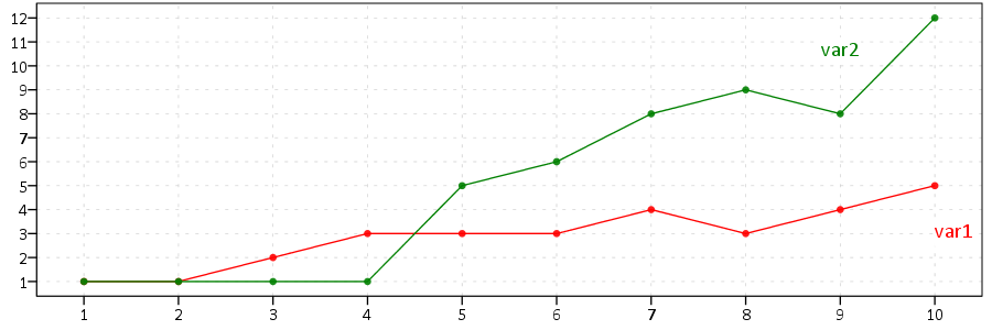
Another option with simple line graphs is to label the lines directly.
******************************. GGRAPH /GRAPHDATASET NAME="graphdataset" VARIABLES=id var1 var2 MISSING=LISTWISE REPORTMISSING=NO /GRAPHSPEC SOURCE=INLINE. BEGIN GPL PAGE: begin(scale(900px,300px)) SOURCE: s=userSource(id("graphdataset")) DATA: id=col(source(s), name("id")) DATA: var1=col(source(s), name("var1")) DATA: var2=col(source(s), name("var2")) GUIDE: axis(dim(1), delta(1)) GUIDE: axis(dim(2), delta(1)) GUIDE: legend(aesthetic(aesthetic.color.exterior), null()) GUIDE: legend(aesthetic(aesthetic.color.interior), null()) SCALE: linear(dim(2), min(1), max(12)) SCALE: linear(dim(1), min(1), max(10)) SCALE: cat(aesthetic(aesthetic.color.interior), map(("var1",color.red),("var2",color.green))) ELEMENT: line(position(id*var1), color("var1"), label("var1")) ELEMENT: point(position(id*var1), color.interior("var1"), shape(shape.circle), transparency.exterior(transparency."1"), transparency.interior(transparency."0.1")) ELEMENT: line(position(id*var2), color("var2"), missing.wings(), label("var2")) ELEMENT: point(position(id*var2), color.interior("var2"), shape(shape.circle), transparency.exterior(transparency."1"), transparency.interior(transparency."0.1")) PAGE: end() END GPL. ******************************.  My template the line label defaults to the middle and is in black. I had to edit the chart to get them the same color and move them to the end of the line. (Those can also be automatically set though via the chart template.) I give some examples of placing the labels exactly where you want them all in syntax in this blog post, https://andrewpwheeler.wordpress.com/2015/01/14/labeling-tricks-in-spss-plots/. |
|
Andy, I can keep color, size, fill and borders, but what should I save in template to keep the place of text "var1" and "var2"?
|
|
I would only putz with the chart template for things you can't do yourself via syntax. It does not always behave how you want. For example I tried awhile back to make the legends consistently at the bottom of the graph and have a bigger font for one set of graphs I needed to generate on a monthly basis. I could get it at the bottom, but the font size never worked out for me.
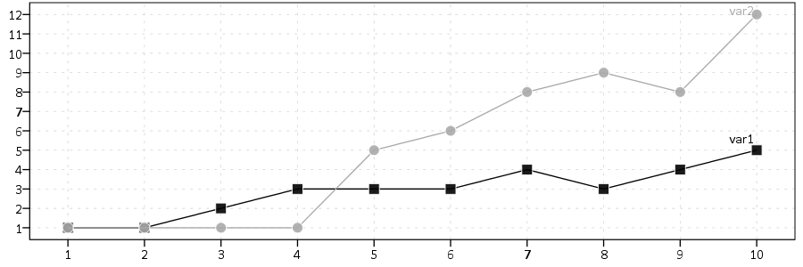
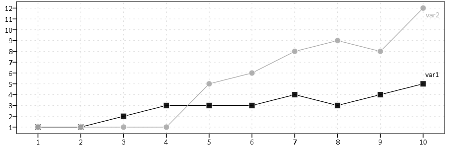
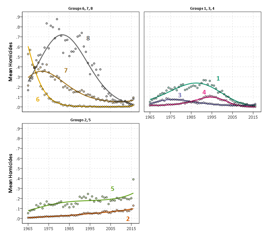
The location of the labels you can fix yourself. The blog post I pointed to showed several ways of doing that. SPSS's automated placement of labels is not too bad for busy charts as well, so if you made the label for only the last point in the series (instead of on the line) its automated placement won't be too shabby. I often edit them alittle though to my taste, but if I needed to do a standardized report that is how I would go about it. Color, size, fill and borders (for chart elements, not the border on the whole graph) you can set right within the inline GPL. So you don't need to worry about the chart template for that. The only thing I think you might need to edit the chart template for the labeling of the lines is to make it so the label inherits the color by default. I have my personal chart template here, https://dl.dropboxusercontent.com/s/drnd9nddedd8w6m/chart_style%28AndyW2-presentation%29.sgt?dl=0, and the section that is relevant to data labels is the "addDataLabels" tag on lines 247-250. <addDataLabels styleOnly="true" colorByMarker="true" labelLocationHorizontal="positive" labelLocationVertical="positive"> <style number="0" font-size="12pt" font-weight="regular" color2="transparent" color="black" label-location-inside="true" margin="1px" padding="1px" stroke-width="0.5pt"/> <style number="1" visible="true" color="transparent" color2="transparent"/> </addDataLabels> I actually just updated it to automatically inherit the color of the element it is labeling. (The "colorByMarker" part.) I also just updated the location to the upper right the "labelLocationHorizontal" and "labelLocationVertical" part. (I may change that in the future though, will have to do some more experimenting.) ------------------------ So here is how I would make this specific chart, using SPSS's automated placement of the labels. I changed the colors to grey-scale, red/green are not good for color blind folks (around 8% of the male population is red/green color deficient!) I changed the background line to have a square shape. This makes it so when they overlap, you can still see the square in the background outside of the circle. (You could make both black here, since the lines are reasonably different, but real data are often not so convenient.) I too like to put the points on top of the line like you did, to reinforce when measurements were taken. I like to make them slightly separate from the line by making the outline white. (I kept the points slightly transparent, although I think making them entirely opaque is reasonable for this example. Seeing the line behind the point is distracting, although it is not a big difference.) I make the points bigger, although that is just a personal preference. I liked your aspect ratio (line charts often need to be longer than taller). This example is excessively large though, so I changed it to 900:300, keeping your 3 to 1 ratio. My template has the default font-size for the X and Y axis slightly larger than usual (I think the defaults are too small, especially for presentations). This size still fits in all the labels nicely though. ******************************. GGRAPH /GRAPHDATASET NAME="graphdataset" VARIABLES=id var1 var2 MISSING=LISTWISE REPORTMISSING=NO /GRAPHSPEC SOURCE=INLINE. BEGIN GPL PAGE: begin(scale(900px,300px)) SOURCE: s=userSource(id("graphdataset")) DATA: id=col(source(s), name("id")) DATA: var1=col(source(s), name("var1")) DATA: var2=col(source(s), name("var2")) GUIDE: axis(dim(1), delta(1)) GUIDE: axis(dim(2), delta(1)) GUIDE: legend(aesthetic(aesthetic.color.exterior), null()) GUIDE: legend(aesthetic(aesthetic.color.interior), null()) SCALE: linear(dim(2), min(1), max(12)) SCALE: linear(dim(1), min(1), max(10)) SCALE: cat(aesthetic(aesthetic.color.interior), map(("var1",color.black),("var2",color.darkgrey))) ELEMENT: line(position(id*var1), label("var1"), color.interior("var1")) ELEMENT: point(position(id*var1), color.interior("var1"), shape(shape.square), transparency.exterior(transparency."0.1"), transparency.interior(transparency."0.1"), size(size."12"), color.exterior(color.white)) ELEMENT: line(position(id*var2), missing.wings(), label("var2"), color.interior("var2")) ELEMENT: point(position(id*var2), color.interior("var2"), shape(shape.circle), transparency.exterior(transparency."0.1"), transparency.interior(transparency."0.1"), size(size."12"), color.exterior(color.white)) PAGE: end() END GPL. ******************************. Here is what that chart looks like, using my chart template I linked to earlier as the default. No manual editing.  So you can see that the labels are slightly obstructed by the points. To really fix where the labels are, here is an example. That takes some code outside of the GGRAPH call though. It also is not necessarily standardized to your "real" data you are applying this too. It only really works when the lines are reasonably spaced apart at the end. This is what SPSS pops out though for me, no hand editing. ******************************. *Trying labels with only the end point. STRING PointLab1 PointLab2 (A4). DO IF id = 10. COMPUTE PointLab1 = "var1". COMPUTE PointLab2 = "var2". END IF. EXECUTE. GGRAPH /GRAPHDATASET NAME="graphdataset" VARIABLES=id var1 var2 PointLab1 PointLab2 MISSING=LISTWISE REPORTMISSING=NO /GRAPHSPEC SOURCE=INLINE. BEGIN GPL PAGE: begin(scale(900px,300px)) SOURCE: s=userSource(id("graphdataset")) DATA: id=col(source(s), name("id")) DATA: var1=col(source(s), name("var1")) DATA: var2=col(source(s), name("var2")) DATA: PointLab1=col(source(s), name("PointLab1"), unit.category()) DATA: PointLab2=col(source(s), name("PointLab2"), unit.category()) GUIDE: axis(dim(1), delta(1)) GUIDE: axis(dim(2), delta(1)) GUIDE: legend(aesthetic(aesthetic.color.exterior), null()) GUIDE: legend(aesthetic(aesthetic.color.interior), null()) SCALE: linear(dim(2), min(1), max(12)) SCALE: linear(dim(1), min(1), max(10)) SCALE: cat(aesthetic(aesthetic.color.interior), map(("var1",color.black),("var2",color.darkgrey))) ELEMENT: line(position(id*var1), color.interior("var1")) ELEMENT: point(position(id*var1), color.interior("var1"), shape(shape.square), transparency.exterior(transparency."0.1"), transparency.interior(transparency."0.1"), size(size."12"), color.exterior(color.white), label(PointLab1)) ELEMENT: line(position(id*var2), missing.wings(), color.interior("var2")) ELEMENT: point(position(id*var2), color.interior("var2"), shape(shape.circle), transparency.exterior(transparency."0.1"), transparency.interior(transparency."0.1"), size(size."12"), color.exterior(color.white), label(PointLab2)) PAGE: end() END GPL. ******************************.  If the lines are too jumbled up for this to work, I often just put the labels wherever they best fit, and/or make separate panels. See below for a recent example in some of my work. This is moving the label locations by hand though, not automated.  Phew, now that I am done with that essay, here are a few more resources you may be interested in: - Hacking the default template blog post, https://andrewpwheeler.wordpress.com/2012/01/03/hacking-the-default-spss-chart-template/ - Single line charts blog post, https://andrewpwheeler.wordpress.com/2013/04/03/some-notes-on-single-line-charts-in-spss/ - Font size advice blog post, https://andrewpwheeler.wordpress.com/2015/10/14/poster-presentations-should-have-a-minimum-font-size-of-25-points/ - Finally, when exporting images from SPSS do not use the default JPEG. Use either vector formats (e.g. emf) or PNG. I have a bunch of posts giving advice on making graphs in SPSS on my blog. I'll stop inundating the folks on the mailing list with all my other relevant posts though! |
«
Return to SPSSX Discussion
|
1 view|%1 views
| Free forum by Nabble | Edit this page |

