Multi-level modelling in SPSS - graphing results
Multi-level modelling in SPSS - graphing results
|
Administrator
|
Forwarded for Matthew... His post wasn't appearing in list and he emailed me.
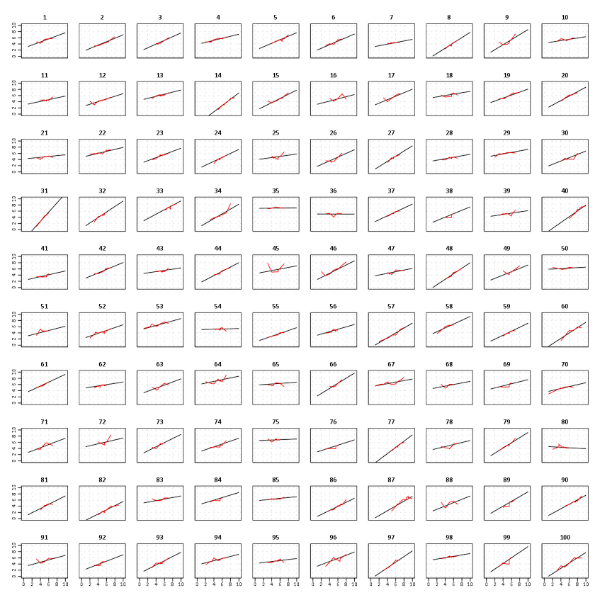
Hi, I am using SPSS to do some fairly simple two-level multi-level analysis (using ‘mixed models’ from the menus) – random intercept models, random intercepts and slopes etc. I’d really like to graph some of the results – for example, plotting the distribution of random intercepts or slopes. This would be very useful from a model-checking point of view, and pedagogically too. I can’t find any way to do this – even on how to automatically extract this data from the analysis. Does anyone have any ideas/thoughts on this? It would also be nice to plot graphs showing the random intercept model results (i.e. graphs like the ones here in Figures 3 and 4: http://www.statstutor.ac.uk/resources/uploaded/multilevelmodelling.pdf). Perhaps I am using the wrong tool and should consider (gulp) other software (e.g. MLWin/Stata). I don’t have a problem with that with regards to research, but from a teaching point of view it complicates things. Any thoughts very welcome. Thanks, Matt Dr Matt Homer Associate Professor in Quantitative Methods and Assessment Schools of Education and Medicine University of Leeds http://www.education.leeds.ac.uk/modx/people/staff/academic/homer
Please reply to the list and not to my personal email.
Those desiring my consulting or training services please feel free to email me. --- "Nolite dare sanctum canibus neque mittatis margaritas vestras ante porcos ne forte conculcent eas pedibus suis." Cum es damnatorum possederunt porcos iens ut salire off sanguinum cliff in abyssum?" |
|
Those plots are all just showing observed vs predicted values. So whatever model you are fitting, save the predicted values. Then you would just make a small-multiple plot using facet wrapping, and plot the observed values as points and the predicted values as a line.
I give related examples of viz. multi-level data on my blog below: - https://andrewpwheeler.wordpress.com/2014/07/13/smoothed-regression-plots-for-multi-level-data/ - https://andrewpwheeler.wordpress.com/2014/03/04/visualizing-multi-level-data-using-ellipses/ The most similar to the R lattice graphics you point to is in the first blog post. It uses the built in procedures in SPSS charts to estimate regression lines, but to replicate you would just save the predicted values and pass those to the chart procedure instead.  And I give examples of superimposing several elements in charts and using small multiples in other posts as well. - https://andrewpwheeler.wordpress.com/2013/04/03/some-notes-on-single-line-charts-in-spss/ - https://andrewpwheeler.wordpress.com/2013/03/18/the-junk-charts-challenge-remaking-a-great-line-chart-in-spss/ - https://andrewpwheeler.wordpress.com/2016/03/08/on-overlapping-error-bars-in-charts/ |
«
Return to SPSSX Discussion
|
1 view|%1 views
| Free forum by Nabble | Edit this page |

