Multiple Graphs in One
|
It's been years since I used SPSS and now I have to use it again on a study conducted where I work.
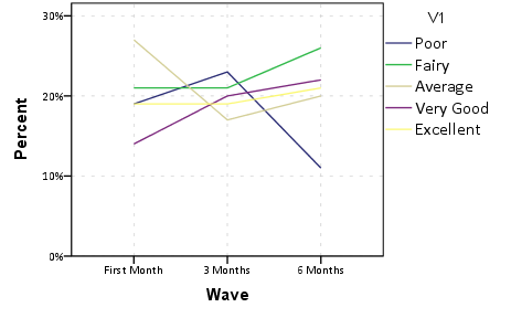
I'm trying to create a graph that will display three variables, e.g.: 1. First month - ability to use the system 2. After 3 months - ability to use the system 3. After 6 months - ability to use the system All with 5-point Likert scale Poor, Fairy, Average, Very Good, Excellent. How can I display that the X axis will be the Likert Scale and the clustered bar graphs will be the N or % of those who answered poor for the first month, after 3 months, and after 6 months, fair for the first month, after 3 months and after 6 months, and so on? |
|
It is useful to know how your data are currently set up, but if your panel data are in long format this is easier to generate this graph through the GUI dialog for GGRAPH. Because this is not how people typically have their data formatted, I generate some fake data in wide format and then transform it to long format and generate the requested graph. I have attached a picture (only slightly edited post-hoc + my personal chart template) from what is produced by the
|
| Free forum by Nabble | Edit this page |


