Overlay two line series on single graph?
Overlay two line series on single graph?
|
Does anyone have any example of doing this?
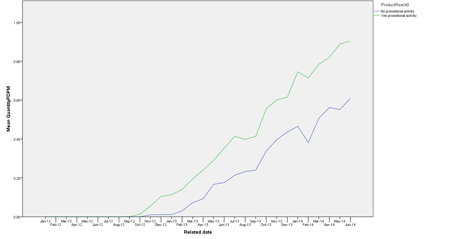
I'm looking to create a graph plotting two different dimensions of different scales onto a single graph. I have got as far as setting up for a single y-axis with the below but hoping to add a second y (right hand side) axis...? Is this at all possible? (Hope the picture loads ok ...?). The second axis is currently stored within the same data file as a separate variable. GGRAPH /GRAPHDATASET NAME="graphdataset" VARIABLES= Period[LEVEL=NOMINAL] MEAN(QuantityPDPM)[name="MEAN_QuantityPDPM"] ProductReach0 MISSING=LISTWISE REPORTMISSING=NO /GRAPHSPEC SOURCE=INLINE. BEGIN GPL PAGE: begin(scale(1600px,800px)) SOURCE: s=userSource(id("graphdataset")) DATA: Period=col(source(s), name("Period"), unit.category()) DATA: MEAN_QuantityPDPM=col(source(s), name("MEAN_QuantityPDPM")) DATA: ProductReach0=col(source(s), name("ProductReach0"), unit.category()) GUIDE: axis(dim(1), label("Related date")) GUIDE: axis(dim(2), label("Mean QuantityPDPM")) GUIDE: legend(aesthetic(aesthetic.color.interior), label("ProductReach0")) SCALE: linear(dim(2), include(0)) ELEMENT: line(position(Period*MEAN_QuantityPDPM), color.interior(ProductReach0), missing.wings()) PAGE: end() END GPL. 
|
Re: Overlay two line series on single graph?
|
You can generate dual-axis charts from
the Chart Builder. Here is syntax generated that way but with the
interval element changed to line.
GGRAPH /GRAPHDATASET NAME="graphdataset" VARIABLES=educ MEAN(salary)[name="MEAN_salary"] MEAN(jobtime)[name="MEAN_jobtime"] MISSING=LISTWISE REPORTMISSING=NO /GRAPHSPEC SOURCE=INLINE. BEGIN GPL SOURCE: s=userSource(id("graphdataset")) DATA: educ=col(source(s), name("educ"), unit.category()) DATA: MEAN_salary=col(source(s), name("MEAN_salary")) DATA: MEAN_jobtime=col(source(s), name("MEAN_jobtime")) GUIDE: axis(dim(1), label("Educational Level (years)")) GUIDE: axis(scale(y1), label("Mean Current Salary"), color(color."3E58AC")) GUIDE: axis(scale(y2), label("Mean Months since Hire"), color(color."2EB848"), opposite()) SCALE: cat(dim(1), include("8", "12", "14", "15", "16", "17", "18", "19", "20", "21")) SCALE: y1 = linear(dim(2), include(0)) SCALE: y2 = linear(dim(2), include(0)) ELEMENT: line(position(educ*MEAN_salary), shape.interior(shape.square), color.interior(color."3E58AC"), scale(y1)) ELEMENT: line(position(educ*MEAN_jobtime), missing.wings(), color.interior(color."2EB848"), scale(y2)) END GPL. Jon Peck (no "h") aka Kim Senior Software Engineer, IBM [hidden email] phone: 720-342-5621 From: Jignesh Sutar <[hidden email]> To: [hidden email] Date: 10/09/2014 06:53 AM Subject: [SPSSX-L] Overlay two line series on single graph? Sent by: "SPSSX(r) Discussion" <[hidden email]> Does anyone have any example of doing this? I'm looking to create a graph plotting two different dimensions of different scales onto a single graph. I have got as far as setting up for a single y-axis with the below but hoping to add a second y (right hand side) axis...? Is this at all possible? (Hope the picture loads ok ...?). The second axis is currently stored within the same data file as a separate variable. GGRAPH /GRAPHDATASET NAME="graphdataset" VARIABLES= Period[LEVEL=NOMINAL] MEAN(QuantityPDPM)[name="MEAN_QuantityPDPM"] ProductReach0 MISSING=LISTWISE REPORTMISSING=NO /GRAPHSPEC SOURCE=INLINE. BEGIN GPL PAGE: begin(scale(1600px,800px)) SOURCE: s=userSource(id("graphdataset")) DATA: Period=col(source(s), name("Period"), unit.category()) DATA: MEAN_QuantityPDPM=col(source(s), name("MEAN_QuantityPDPM")) DATA: ProductReach0=col(source(s), name("ProductReach0"), unit.category()) GUIDE: axis(dim(1), label("Related date")) GUIDE: axis(dim(2), label("Mean QuantityPDPM")) GUIDE: legend(aesthetic(aesthetic.color.interior), label("ProductReach0")) SCALE: linear(dim(2), include(0)) ELEMENT: line(position(Period*MEAN_QuantityPDPM), color.interior(ProductReach0), missing.wings()) PAGE: end() END GPL. <http://spssx-discussion.1045642.n5.nabble.com/file/n5727556/Capture2.png> -- View this message in context: http://spssx-discussion.1045642.n5.nabble.com/Overlay-two-line-series-on-single-graph-tp5727556.html Sent from the SPSSX Discussion mailing list archive at Nabble.com. ===================== To manage your subscription to SPSSX-L, send a message to [hidden email] (not to SPSSX-L), with no body text except the command. To leave the list, send the command SIGNOFF SPSSX-L For a list of commands to manage subscriptions, send the command INFO REFCARD ===================== To manage your subscription to SPSSX-L, send a message to [hidden email] (not to SPSSX-L), with no body text except the command. To leave the list, send the command SIGNOFF SPSSX-L For a list of commands to manage subscriptions, send the command INFO REFCARD |
Re: Overlay two line series on single graph?
|
Brilliant thanks Jon, I was able to replicate that example using Chart Builder.
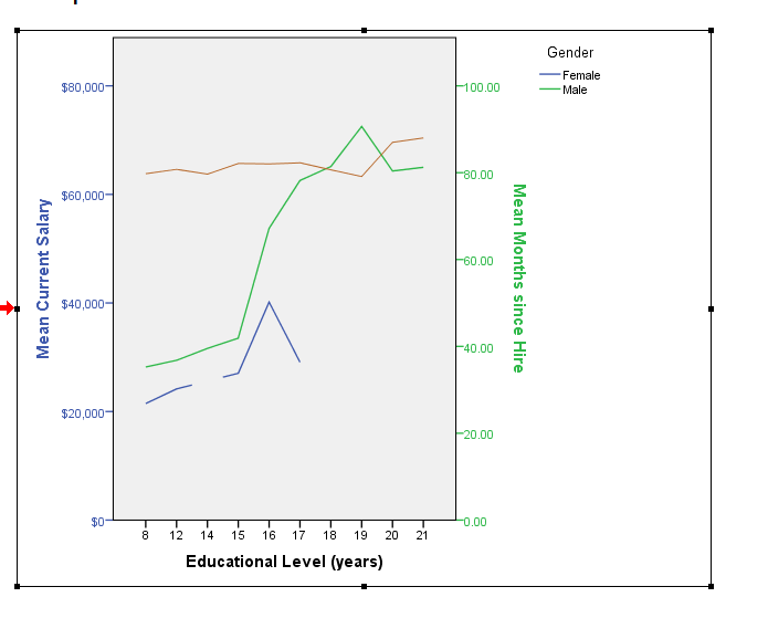
In my example you'll see that I have the original y axis split on promotional and no promotional groups. Is this possible with Dual charts also? The Chart Builder automatically deleted this specification as soon as I added the second y axis. Say in the example you share you wanted to have 4 lines on that chart, split by gender, would that be possible? I appreciate it makes the chart more difficult to read but in fact in my example I can trick the data as the no promotional group will have no data so in fact the addition of new line on the graph shall only be one? For example you could have mean current salary on LHS and then total mean month since hire where you force that to be an average of men and female i.e. aggregate outfile=* mode=addvariables /break=educ /jobtimeTotal=mean(jobtime). So the resulting graph would contain only 3 lines? |
Re: Overlay two line series on single graph?
|
Hi Jon, I think tweaking the syntax as below give me close to what I am after:
aggregate outfile=* mode=addvariables overwrite=yes /break=educ /jobtime=mean(jobtime). GGRAPH /GRAPHDATASET NAME="graphdataset" VARIABLES=educ gender MEAN(salary)[name="MEAN_salary"] MEAN(jobtime)[name="MEAN_jobtime"] MISSING=LISTWISE REPORTMISSING=NO /GRAPHSPEC SOURCE=INLINE. BEGIN GPL SOURCE: s=userSource(id("graphdataset")) DATA: educ=col(source(s), name("educ"), unit.category()) DATA: MEAN_salary=col(source(s), name("MEAN_salary")) DATA: MEAN_jobtime=col(source(s), name("MEAN_jobtime")) DATA: gender=col(source(s), name("gender"), unit.category()) GUIDE: axis(dim(1), label("Educational Level (years)")) GUIDE: axis(scale(y1), label("Mean Current Salary"), color(color."3E58AC")) GUIDE: axis(scale(y2), label("Mean Months since Hire"), color(color."2EB848"), opposite()) GUIDE: legend(aesthetic(aesthetic.color.interior), label("Gender")) SCALE: cat(dim(1), include("8", "12", "14", "15", "16", "17", "18", "19", "20", "21")) SCALE: y1 = linear(dim(2), include(0)) SCALE: y2 = linear(dim(2), include(0)) ELEMENT: line(position(educ*MEAN_salary), color.interior(gender), shape.interior(shape.square), scale(y1)) ELEMENT: line(position(educ*MEAN_jobtime), missing.wings(), color.interior(color."b86b2e"), scale(y2)) END GPL.  |
«
Return to SPSSX Discussion
|
1 view|%1 views
| Free forum by Nabble | Edit this page |

