Replicating Canonical Discriminant Functions Plot
Replicating Canonical Discriminant Functions Plot
|
I'm trying to replicate the Canonical Discriminant Functions Plot that is an optional output from DISCRIMINANT analysis, specifically plotting the discriminant function scores from the first two dimensions against each other and then their centroids also.
The output graph from DISCRIMINATE is: 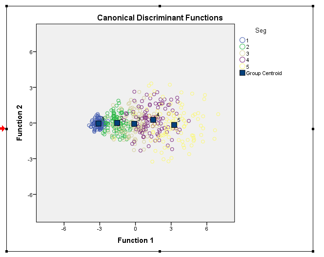 I am able to plot the points all OK but there are two things I'd like to improve on. 1) How to be able to plot the Centroids without creating an AGGREGATED mean variable i.e. to be able to use some feature within GPL/GGRAPH to do so? 2) How to get the legend label for "Group Centroids" analogous to that in from DISCRIMINATE output. The line of code in bold below was my failed attempt. 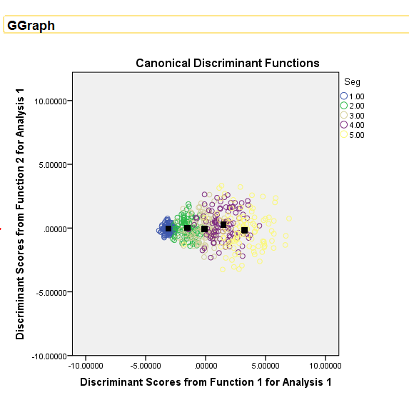 INPUT PROGRAM. LOOP #i=1 to 5. - LOOP #j=1 to 100. - COMPUTE Seg=#i. - VECTOR V(9). - LOOP #k=1 TO 9. - COMPUTE V(#k)=RV.UNIFORM(0,1)*#i. - END LOOP. - END CASE. - END LOOP. END LOOP. END FILE. END INPUT PROGRAM. DISCRIMINANT /GROUPS=Seg(1 5) /VARIABLES=V1 TO V9 /ANALYSIS ALL /SAVE=SCORES (DSF) /PRIORS EQUAL /STATISTICS=COEFF RAW /PLOT=COMBINED /CLASSIFY=NONMISSING POOLED. * Chart Builder. GGRAPH /GRAPHDATASET NAME="graphdataset" VARIABLES=DSF1 DSF2 Seg MISSING=LISTWISE REPORTMISSING=NO /GRAPHSPEC SOURCE=INLINE. BEGIN GPL SOURCE: s=userSource(id("graphdataset")) DATA: DSF1=col(source(s), name("DSF1")) DATA: DSF2=col(source(s), name("DSF2")) DATA: Seg=col(source(s), name("Seg"), unit.category()) GUIDE: axis(dim(1), label("Discriminant Scores from Function 1 for Analysis 1")) GUIDE: axis(dim(2), label("Discriminant Scores from Function 2 for Analysis 1")) SCALE: linear( dim( 1 ), min(-10), max(10) ) SCALE: linear( dim( 2 ), min(-10), max(10) ) GUIDE: legend(aesthetic(aesthetic.color.exterior), label("Seg")) ELEMENT: point(position(DSF1*DSF2), color.exterior(Seg)) END GPL. AGGREGATE OUTFILE=* MODE=ADDVARIABLES /BREAK=Seg /DSFCentroid1=MEAN(DSF1) /DSFCentroid2=MEAN(DSF2). * Chart Builder. GGRAPH /GRAPHDATASET NAME="graphdataset" VARIABLES=DSF1 DSF2 DSFCentroid1 DSFCentroid2 Seg MISSING=LISTWISE REPORTMISSING=NO /GRAPHSPEC SOURCE=INLINE. BEGIN GPL SOURCE: s=userSource(id("graphdataset")) DATA: DSF1=col(source(s), name("DSF1")) DATA: DSF2=col(source(s), name("DSF2")) DATA: DSFCentroid1=col(source(s), name("DSFCentroid1")) DATA: DSFCentroid2=col(source(s), name("DSFCentroid2")) DATA: Seg=col(source(s), name("Seg"), unit.category()) GUIDE: text.title(label("Canonical Discriminant Functions")) GUIDE: axis(dim(1), label("Discriminant Scores from Function 1 for Analysis 1")) GUIDE: axis(dim(2), label("Discriminant Scores from Function 2 for Analysis 1")) SCALE: linear( dim( 1 ), min(-10), max(10) ) SCALE: linear( dim( 2 ), min(-10), max(10) ) GUIDE: legend(aesthetic(aesthetic.color.exterior), label("Seg")) GUIDE: legend(aesthetic(aesthetic.shape), label("Group Centroid")) ELEMENT: point(position(DSF1*DSF2), color.exterior(Seg)) ELEMENT: point(position(DSFCentroid1*DSFCentroid2), color.interior(color.black), shape(shape.square)) END GPL. |
|
To get something in the legend you have to map it to an attribute. See the two "SCALE: cat" statements below, and in the ELEMENT statement for the centroids instead of "color.interior(color.black)" I use "color.interior("Cent")"
***********************************************. GGRAPH /GRAPHDATASET NAME="graphdataset" VARIABLES=DSF1 DSF2 DSFCentroid1 DSFCentroid2 Seg MISSING=LISTWISE REPORTMISSING=NO /GRAPHSPEC SOURCE=INLINE. BEGIN GPL SOURCE: s=userSource(id("graphdataset")) DATA: DSF1=col(source(s), name("DSF1")) DATA: DSF2=col(source(s), name("DSF2")) DATA: DSFCentroid1=col(source(s), name("DSFCentroid1")) DATA: DSFCentroid2=col(source(s), name("DSFCentroid2")) DATA: Seg=col(source(s), name("Seg"), unit.category()) GUIDE: text.title(label("Canonical Discriminant Functions")) GUIDE: axis(dim(1), label("Discriminant Scores from Function 1 for Analysis 1")) GUIDE: axis(dim(2), label("Discriminant Scores from Function 2 for Analysis 1")) SCALE: linear( dim( 1 ), min(-10), max(10) ) SCALE: linear( dim( 2 ), min(-10), max(10) ) SCALE: cat(aesthetic(aesthetic.color.interior), map(("Cent",color.black))) SCALE: cat(aesthetic(aesthetic.shape), map(("Cent",shape.square))) GUIDE: legend(aesthetic(aesthetic.color.exterior), label("Seg")) GUIDE: legend(aesthetic(aesthetic.shape), label("Group Centroid")) ELEMENT: point(position(DSF1*DSF2), color.exterior(Seg)) ELEMENT: point(position(DSFCentroid1*DSFCentroid2), color.interior("Cent"), shape("Cent")) END GPL. ***********************************************. Using AGGREGATE to get the centroid is about as effective as using GPL code I'm afraid. The only way without that I know how is to use a second GRAPHDATASET command and have an aggregate dataset. (Note the dataset needs to be named for this to work.) [There may be a way to get the "summary.mean" type functions inside of an element statement to work, but I'm unsure offhand since both dimensions are continuous.] ***********************************************. DATASET NAME Da. GGRAPH /GRAPHDATASET DATASET="Da" NAME="graphdataset" VARIABLES=DSF1 DSF2 Seg MISSING=LISTWISE REPORTMISSING=NO /GRAPHDATASET DATASET="Da" NAME="Two" VARIABLES=Seg MEAN(DSF1)[NAME="DSFCentroid1"] MEAN(DSF2)[NAME="DSFCentroid2"] /GRAPHSPEC SOURCE=INLINE. BEGIN GPL SOURCE: s=userSource(id("graphdataset")) DATA: DSF1=col(source(s), name("DSF1")) DATA: DSF2=col(source(s), name("DSF2")) DATA: Seg=col(source(s), name("Seg"), unit.category()) SOURCE: t=userSource(id("Two")) DATA: SegT=col(source(t), name("Seg"), unit.category()) DATA: DSFCentroid1=col(source(t), name("DSFCentroid1")) DATA: DSFCentroid2=col(source(t), name("DSFCentroid2")) GUIDE: text.title(label("Canonical Discriminant Functions")) GUIDE: axis(dim(1), label("Discriminant Scores from Function 1 for Analysis 1")) GUIDE: axis(dim(2), label("Discriminant Scores from Function 2 for Analysis 1")) SCALE: linear( dim( 1 ), min(-10), max(10) ) SCALE: linear( dim( 2 ), min(-10), max(10) ) SCALE: cat(aesthetic(aesthetic.color.interior), map(("Cent",color.black))) SCALE: cat(aesthetic(aesthetic.shape), map(("Cent",shape.square))) GUIDE: legend(aesthetic(aesthetic.color.exterior), label("Seg")) GUIDE: legend(aesthetic(aesthetic.shape), label("Group Centroid")) ELEMENT: point(position(DSF1*DSF2), color.exterior(Seg)) ELEMENT: point(position(DSFCentroid1*DSFCentroid2), color.interior("Cent"), shape("Cent")) END GPL. ***********************************************. But you can do some cooler things with the centroid in the dataset though ;) ***********************************************. *Links to centroid. FORMATS DSF1 DSF2 DSFCentroid1 DSFCentroid2 (F2.0). GGRAPH /GRAPHDATASET NAME="graphdataset" VARIABLES=DSF1 DSF2 DSFCentroid1 DSFCentroid2 Seg MISSING=LISTWISE REPORTMISSING=NO /GRAPHSPEC SOURCE=INLINE. BEGIN GPL SOURCE: s=userSource(id("graphdataset")) DATA: DSF1=col(source(s), name("DSF1")) DATA: DSF2=col(source(s), name("DSF2")) DATA: DSFCentroid1=col(source(s), name("DSFCentroid1")) DATA: DSFCentroid2=col(source(s), name("DSFCentroid2")) DATA: Seg=col(source(s), name("Seg"), unit.category()) GUIDE: text.title(label("Canonical Discriminant Functions")) GUIDE: axis(dim(1), label("Discriminant Scores from Function 1 for Analysis 1")) GUIDE: axis(dim(2), label("Discriminant Scores from Function 2 for Analysis 1")) SCALE: linear( dim( 1 ), min(-6), max(6) ) SCALE: linear( dim( 2 ), min(-6), max(6) ) SCALE: cat(aesthetic(aesthetic.color.interior), map(("Cent",color.black))) SCALE: cat(aesthetic(aesthetic.shape), map(("Cent",shape.square))) GUIDE: legend(aesthetic(aesthetic.color.exterior), label("Seg")) GUIDE: legend(aesthetic(aesthetic.shape), label("Group Centroid")) ELEMENT: edge(position((DSF1*DSF2)+(DSFCentroid1*DSFCentroid2)), color(Seg)) ELEMENT: point(position(DSF1*DSF2), color.exterior(Seg)) END GPL. ***********************************************. 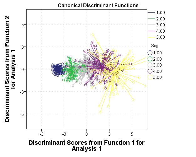 Or because of the overlap in the groups a simpler representation may be in order, here I only plot the alpha hulls of each group and the centroid. ***********************************************. *Alpha hulls instead of points. GGRAPH /GRAPHDATASET NAME="graphdataset" VARIABLES=DSF1 DSF2 DSFCentroid1 DSFCentroid2 Seg MISSING=LISTWISE REPORTMISSING=NO /GRAPHSPEC SOURCE=INLINE. BEGIN GPL SOURCE: s=userSource(id("graphdataset")) DATA: DSF1=col(source(s), name("DSF1")) DATA: DSF2=col(source(s), name("DSF2")) DATA: DSFCentroid1=col(source(s), name("DSFCentroid1")) DATA: DSFCentroid2=col(source(s), name("DSFCentroid2")) DATA: Seg=col(source(s), name("Seg"), unit.category()) GUIDE: text.title(label("Canonical Discriminant Functions")) GUIDE: axis(dim(1), label("Discriminant Scores from Function 1 for Analysis 1")) GUIDE: axis(dim(2), label("Discriminant Scores from Function 2 for Analysis 1")) SCALE: linear( dim( 1 ), min(-6), max(6) ) SCALE: linear( dim( 2 ), min(-6), max(6) ) GUIDE: legend(aesthetic(aesthetic.color.exterior), label("Seg")) GUIDE: legend(aesthetic(aesthetic.shape), label("Group Centroid")) ELEMENT: edge(position(link.alpha(DSF1*DSF2, radius(1))), color.interior(Seg)) ELEMENT: point(position(DSFCentroid1*DSFCentroid2), color.interior(Seg), shape(shape.square)) END GPL. ***********************************************. 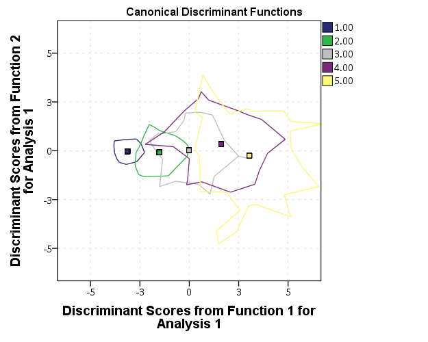 |
Re: Replicating Canonical Discriminant Functions Plot
|
Thanks Andy!
Multiple datasets in the GPL code seems to add a lot more code and still requires AGGREGATE variables to be pre-created. I don't think there is much benefit in this approach. I'll stick to aggregating. Very cool indeed, the alternative ways you have plotted this data better captures the sole reason for plotting this data in the first place. Do you know a hack how I can replace the default graph produced by DISCRIMINATE by one (or both) of these?! ;-) |
|
The code that has the two GRAPHDATASET commands does not need the AGGREGATE beforehand, but basically results in as more lines of code than your original solution.
Not able to check at the moment, but I thought you could post-hoc edit the scatterplots to show lines to centroids, but maybe I am making things up. Interactive charts where you could turn off/on the hulls and the points I agree would be nice as well. As would being able to interactively turn up the alpha transparency. |
Re: Replicating Canonical Discriminant Functions Plot
|
Sorry, yes, you're right, I didn't take note of the "MEAN(DSF1)" so yes that could be a preferable option to having to explicitly generate the variables in the dataset.
Also, when you said "here I only plot the alpha hulls of each group and the centroid" what are the alternatives that one might consider? |
|
"What are the alternatives?"
The obvious one is superimposing the points as well - but as I said they are too dense and so complicate the goal of visualizing where the point clouds intersect. The alpha or convex hull work pretty well here - where the data are approximately normally distributed (in both dimensions) and do not have outliers. Data reduction in the plot basically. Drawing the original points much smaller and transparent would make the original graph more informative as well. More generally one could plot the covariance ellipses of each of the subgroups, but that is a bit more complicated and not a simple option in inline GPL statements. See https://andrewpwheeler.wordpress.com/2014/03/04/visualizing-multi-level-data-using-ellipses/ for some examples of ellipses in SPSS (and the Friendly, Monette & Fox paper has some discussion about ellipses for discriminant analysis.) These are just general points about viz. groups in scatterplots. I have no real knowledge of discriminant analysis in particular. |
Re: Replicating Canonical Discriminant Functions Plot
|
Thanks again Andy,
I've taken the two graph options you demonstrated and plotted them together, paneled in single graph page. I tried to go for the dual GRAPHDATASET approach but kept receiving an error message: "cannot use algebra operation on listwise from <source1> and listwise from <source2> without an explicit join" Is this still doable with this approach? In the meantime, I reverted back to creating pre aggregated centroids. I can panel the two graphs side-by-side. However there are a few tiny cosmetic improvements that I'd like to try overcome... The titles "Canonical Discriminant Functions", I'd prefer only a single title but centered horizontally across the page. Likewise for the x-axis guide label. More importantly, I couldn't get the legend to sit nicely, either to the far right or just offset to the right (or left) of the center of the page (between the two graphs). I tried all sort of combinations, having a legend for the right chart only, left chart only, and then both charts and the legends either position themselves always in the middle of the right chart (ugly) but never only to the far right (preferred). Again any thoughts much appreciated. I'm attaching syntax, if it helps. Replicating_Canonical_Discriminant_Functions_Plot.sps 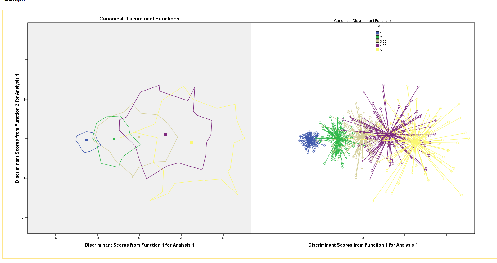 |
Re: Replicating Canonical Discriminant Functions Plot
|
The other thing, which I forgot to mention (and what seems like a bug), is that sometimes the left hand side title "Canonical Discriminant Functions" is in bold font but when run again the right hand side might be in bold but not the other?
I know there is a setting for the chart background color as you can see the left hand side is grey background and the right hand side white but there is a setting for this in the template and it is consistent. Whereas for the graph title, it seems to be inconsistent sometimes boding left hand side other time right hand side. |
|
In reply to this post by Jignesh Sutar
1) For the error, you can not use graph algebra from two different data sources. So you can not draw the lines type graph unless you have the centroid values within the same dataset.
Imagine a simpler situation, in pseudo code /GRAPHDATASET DATASET='One' VARIABLES = X /GRAPHDATASET DATASET='Two' VARIABLES = Y . . . ELEMENT: point(position(X*Y)) How is SPSS suppossed to know which X value goes to which Y value, since they are in different datasets? 2) For the chart template, if you look at the default template you will see a bunch of "<addFrame .... </addframe>" tags. These basically define the style of all the different boxes that make up the chart. They are not necessarily inherited for new boxes, so if you insert multiple graphs using PAGE and they can be assigned different formats. The current template I am using makes all of the separate inset charts have no background, although I can't say off-hand exactly which setting defines that. Here is that template, https://dl.dropbox.com/s/drnd9nddedd8w6m/chart_style%28AndyW2-presentation%29.sgt?dl=0, and I would start by the seeing if the settings around line 223 are what define all of the subcharts to have transparent backgrounds. |
|
I think my general advice though is just do two different charts. It is IMO not worth putzing around with the chart template too much, often I can't get them exactly how I want when I have tried.
|
«
Return to SPSSX Discussion
|
1 view|%1 views
| Free forum by Nabble | Edit this page |

