Stacked bar chart with lines
|
Hi,
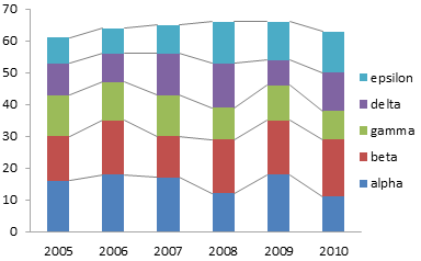
I'm wondering if could be possible to create a bar chart in SPSS as the example in the image below?  The goal is to create a stacked bar chart with lines, and probably the GPL charts are the right choice? Any suggestions would be really appreciated. Thanks in advance. C. |
|
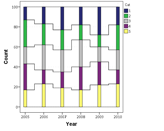
Here is an example, like I said in the email (off-list) it is not easily possible to have the lines meet at the ends of the stacked bars due to the way the grammar of graphics works for categorical areas.
So my idea was to use a stacked area chart in the background to draw the lines, just by making the interior color transparent. To fix the not meeting at the edge problem I use stepped lines instead of the usual interpolated ones. I think it produces a reasonable result. (The slopes of the interpolated lines are meaningless with the stacked lines anyway, so it further reinforces the categorical nature of the steps, but still provides a guideline.) *********************************************. SET SEED 10. INPUT PROGRAM. LOOP #Y = 2005 TO 2010. LOOP #C = 1 TO 100. COMPUTE Year = #Y. COMPUTE Cat = TRUNC(RV.UNIFORM(1,6)). END CASE. END LOOP. END LOOP. END FILE. END INPUT PROGRAM. DATASET NAME Sim. VARIABLE LEVEL Year Cat (ORDINAL). FORMATS Year (F4.0) Cat (F1.0). *Stacked Bar. GGRAPH /GRAPHDATASET NAME="graphdataset" VARIABLES=Year COUNT()[name="COUNT"] Cat MISSING=LISTWISE REPORTMISSING=NO /GRAPHSPEC SOURCE=INLINE. BEGIN GPL SOURCE: s=userSource(id("graphdataset")) DATA: Year=col(source(s), name("Year"), unit.category()) DATA: COUNT=col(source(s), name("COUNT")) DATA: Cat=col(source(s), name("Cat"), unit.category()) GUIDE: axis(dim(1), label("Year")) GUIDE: axis(dim(2), label("Count")) GUIDE: legend(aesthetic(aesthetic.color.interior), label("Cat")) SCALE: linear(dim(2), include(0)) ELEMENT: interval.stack(position(Year*COUNT), color.interior(Cat), shape.interior(shape.square)) END GPL. *Stacked Area. GGRAPH /GRAPHDATASET NAME="graphdataset" VARIABLES=Year COUNT()[name="COUNT"] Cat MISSING=LISTWISE REPORTMISSING=NO /GRAPHSPEC SOURCE=INLINE. BEGIN GPL SOURCE: s=userSource(id("graphdataset")) DATA: Year=col(source(s), name("Year"), unit.category()) DATA: COUNT=col(source(s), name("COUNT")) DATA: Cat=col(source(s), name("Cat"), unit.category()) GUIDE: axis(dim(1), label("Year")) GUIDE: axis(dim(2), label("Count")) GUIDE: legend(aesthetic(aesthetic.color.interior), label("Cat")) SCALE: linear(dim(2), include(0)) ELEMENT: area.stack(position(Year*COUNT), color.interior(Cat)) END GPL. *Now putting together. GGRAPH /GRAPHDATASET NAME="graphdataset" VARIABLES=Year COUNT()[name="COUNT"] Cat MISSING=LISTWISE REPORTMISSING=NO /GRAPHSPEC SOURCE=INLINE. BEGIN GPL SOURCE: s=userSource(id("graphdataset")) DATA: Year=col(source(s), name("Year"), unit.category()) DATA: COUNT=col(source(s), name("COUNT")) DATA: Cat=col(source(s), name("Cat"), unit.category()) GUIDE: axis(dim(1), label("Year")) GUIDE: axis(dim(2), label("Count")) GUIDE: legend(aesthetic(aesthetic.color.interior), label("Cat")) SCALE: linear(dim(2), include(0)) ELEMENT: area.stack(position(Year*COUNT), color.interior(Cat), transparency.interior(transparency."1")) ELEMENT: interval.stack(position(Year*COUNT), color.interior(Cat), shape.interior(shape.square)) END GPL. *Can use smooth.step to make the lines meet at the ends. *Also here make axis numeric, so can control the width of the bars. GGRAPH /GRAPHDATASET NAME="graphdataset" VARIABLES=Year COUNT()[name="COUNT"] Cat MISSING=LISTWISE REPORTMISSING=NO /GRAPHSPEC SOURCE=INLINE. BEGIN GPL SOURCE: s=userSource(id("graphdataset")) DATA: Year=col(source(s), name("Year")) DATA: COUNT=col(source(s), name("COUNT")) DATA: Cat=col(source(s), name("Cat"), unit.category()) GUIDE: axis(dim(1), label("Year")) GUIDE: axis(dim(2), label("Count")) GUIDE: legend(aesthetic(aesthetic.color.interior), label("Cat")) SCALE: linear(dim(2), include(0)) ELEMENT: area.stack(position(smooth.step.center(Year*COUNT)), color.interior(Cat), transparency.interior(transparency."1")) ELEMENT: interval.stack(position(Year*COUNT), color.interior(Cat), shape.interior(shape.square), size(size."12")) END GPL. *********************************************. And here is what that last call looks like with my personal chart template.  Stacked areas are reasonable when there are a few stacks, but also keep in mind just using a line chart. The higher up the stack the harder it becomes to assess actual changes in the proportion or counts or whatever. |
Re: Stacked bar chart with lines
|
Hi,
=====================
To manage your subscription to SPSSX-L, send a message to
[hidden email] (not to SPSSX-L), with no body text except the
command. To leave the list, send the command
SIGNOFF SPSSX-L
For a list of commands to manage subscriptions, send the command
INFO REFCARD
It is much more simple to create these graphs using the r plugin. The stacked bar is created as folows: begin program r. library(ggplot2) casedata0 <- spssdata.GetDataFromSPSS() ggplot()+geom_bar(data=casedata0,width=0.4,mapping=aes(x=Year, fill=factor(Cat))) end program. begin program r. library(ggplot2) library(reshape2) casedata0 <- spssdata.GetDataFromSPSS() g<-melt(apply(table(casedata0$Cat,casedata0$Year),2,cumsum)) ggplot()+geom_line(data=g, mapping=aes(x=Var2,y=value, group=Var1))+ geom_bar(data=casedata0,width=0.4,mapping=aes(x=Year, fill=factor(Cat))) end program. both ggplot2 and reshape2 have to be installed Frans |
|
I would agree ggplot2 is less verbose than GPL in SPSS. SPSS has the advantage of having the GUI, and then you don't need to worry about passing data back and forth. My first two charts were generated in the GUI, and then the rest is copy+paste besides the aesthetics for the lines.
The ggplot version has the same problem as SPSS when using just straight up lines compared to the excel version - the lines don't terminate at the edges of the bars, they terminate at the center of the bin. ggplot2 has a geom_step, but does not have an option to have the step in the middle, so my example in SPSS cannot be replicated in ggplot2. If you do below with the same data, here is my default plot I get (SPSS V22, so the R is V 2.15). ggplot()+geom_line(data=g, mapping=aes(x=factor(Var2),y=value, group=Var1))+ geom_bar(data=casedata0,,width=0.4, mapping=aes(x=factor(Year), fill=factor(Cat)))  I made the years as factors to make it more clear. |
«
Return to SPSSX Discussion
|
1 view|%1 views
| Free forum by Nabble | Edit this page |

