Where are my missing points?
|
Hi all
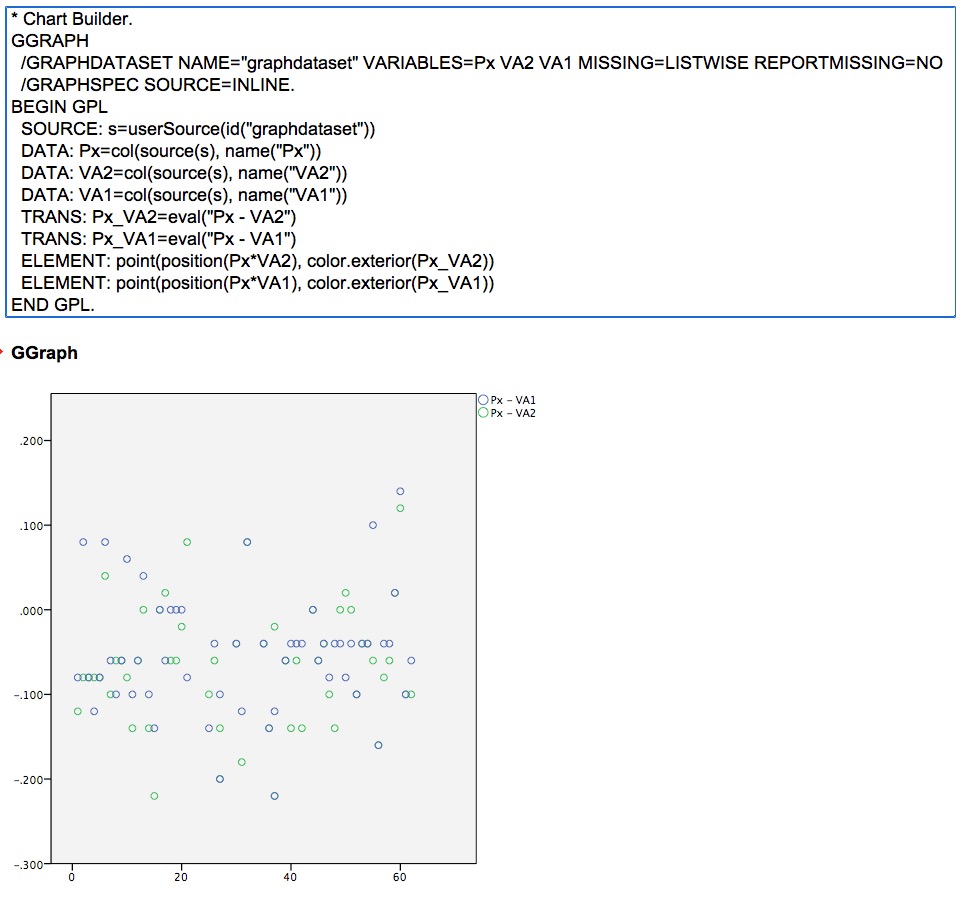
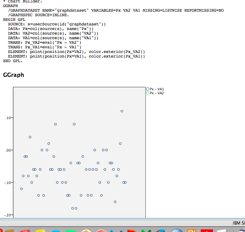
I'm still struggling with some basic things - but with help, I am making headway. This little problem baffles me, though ... and I wonder if a graph wizard is bored enough to let me know what I am missing. I am running the same SPSS and the same data on two differently-located computers. I have run the Graph function and I get a different output for (seemingly) the same input. I have checked my procedures several times and, as far as I can tell, they appear to be identical. One graph (All Points image attached) has two pairs of X-Y points with the legend showing the two differently-coloured sets, Px-VA1 and Px-VA2. This is shown as two different colours on the chart. This is perfect and I can draw a best fit line through each of the two data sets. The second graph (Missing Points, attached) from the second computer has two pairs of X-Y points with the legend showing the two differently-coloured sets, Px-VA1 and Px-VA2 ... but one data set, Px-VA2, appears to be missing. Consequently, I can only draw one best fit line. Please would someone tell me why this second data set, Px-VA2, does not appear in my graph, despite my seemingly running each Graph process, on separate computers, using the same data but getting different output. I am puzzled as to where I have gone wrong?? Many thanks  
|
|
You would have to provide the data to be sure, but I would hazard a guess that in the second example [Px_VA1 = Px_VA2] for all points. Because you draw Px_VA1 last in the element statements they are drawn on top, and so entirely cover up the green points. (If you look at the two graphs, all the blue points in the second appear to be green points in the first.)
A way to test this is to switch the order of the ELEMENT statements and see if only green points are drawn. |
|
Thank you
Here is the data …. but this doesn’t explain why each computer with, seemingly, the same conditions produces the deficit. Your idea that maybe one is overlying the other sound possible … Thanks Bish
|
|
The data you posted produce the first scatterplot. If you are using the same syntax, the only explanation for the different results on the different machines are then the data is different.
***************************************************. SPSSINC GETURI DATA URI="http://spssx-discussion.1045642.n5.nabble.com/attachment/5729812/0/Test.sav" FILETYPE=SAV DATASET=Scatt /OPTIONS SHEETNUMBER=1 READNAMES=YES ASSUMEDSTRWIDTH=32767. GGRAPH /GRAPHDATASET NAME="graphdataset" VARIABLES=Px VA1 VA2 MISSING=LISTWISE REPORTMISSING=NO /GRAPHSPEC SOURCE=INLINE. BEGIN GPL SOURCE: s=userSource(id("graphdataset")) DATA: Px=col(source(s), name("Px")) DATA: VA1=col(source(s), name("VA1")) DATA: VA2=col(source(s), name("VA2")) TRANS: Px_VA2=eval("Px - VA2") TRANS: Px_VA1=eval("Px - VA1") ELEMENT: point(position(Px*VA2), color.exterior(Px_VA2)) ELEMENT: point(position(Px*VA1), color.exterior(Px_VA1)) END GPL. ***************************************************. |
|
|
In reply to this post by Andy W
Very many thanks for this, Andy. This was a simple error but eluded me because I though that the two files were identical!
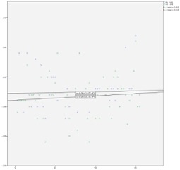
It was the data but I do not know why it had changed when I transferred it from one computer to the other. I’ve now done what I needed to do … but I have one last request. The formulae contained within the two slope labels positioned centrally on the enclosed graph. When originally produced, the labels overlapped each other. In order to get them separated, I had to enlarge the graph, as shown here. Is there a way to manually re-locate these two labels to a more convenient position. I can neither find a way to drag and drop, nor see anywhere in Chart Editor to re-position these labels. FILE='/Users/bishee/Desktop/Test.sav'. DATASET NAME DataSet1 WINDOW=FRONT. * Chart Builder. GGRAPH /GRAPHDATASET NAME="graphdataset" VARIABLES=Px VA1 VA2 MISSING=LISTWISE REPORTMISSING=NO /GRAPHSPEC SOURCE=INLINE. BEGIN GPL SOURCE: s=userSource(id("graphdataset")) DATA: Px=col(source(s), name("Px")) DATA: VA1=col(source(s), name("VA1")) DATA: VA2=col(source(s), name("VA2")) TRANS: Px_VA1=eval("Px - VA1") TRANS: Px_VA2=eval("Px - VA2") ELEMENT: point(position(Px*VA1), color.exterior(Px_VA1)) ELEMENT: point(position(Px*VA2), color.exterior(Px_VA2)) END GPL. 
|
|
Not sure about the labels from the equations, but see https://andrewpwheeler.wordpress.com/2015/01/14/labeling-tricks-in-spss-plots/ for other advice about placing point labels.
|
«
Return to SPSSX Discussion
|
1 view|%1 views
| Free forum by Nabble | Edit this page |

