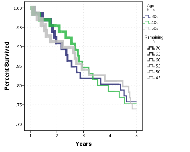
add number at risk to the Kaplan-Meier plot in survival analysis
Best all, Juan Erasmus MC, Rotterdam |
|
I don't have KM on my machine, but with this simple a model you can calculate the surviving N yourself to add into the plot. Below is one way to do that.
The resulting graph you will see is a bit crowded with labels. If you turned it into a discrete table (I don't remember exactly what KM spits out) - it would produce fewer stats. *************************************************. SET SEED 10. INPUT PROGRAM. LOOP #i = 1 TO 200. COMPUTE age = TRUNC(RV.UNIFORM(1,4)). COMPUTE SurvTime = RV.UNIFORM(1,15). END CASE. END LOOP. END FILE. END INPUT PROGRAM. DATASET NAME Sim. VALUE LABELS age 1 '30s' 2 '40s' 3 '50s'. *Censoring cases above 5. DO IF SurvTime > 5. COMPUTE Vital = 0. COMPUTE CensTime = 5. ELSE. COMPUTE Vital = 1. COMPUTE CensTime = SurvTime. END IF. *KM CensTime BY age /STATUS=Vital(1) /PLOT SURVIVAL /TEST LOGRANK. *Manually calculate remaining cases. SORT CASES BY age SurvTime. AGGREGATE OUTFILE=* MODE=ADDVARIABLES /BREAK age /TotAgeN = N. *Calculate N within so have the remaining number. DO IF ($casenum = 1) OR (age <> LAG(age) ). COMPUTE RemN = TotAgeN. ELSE IF Vital = 1. COMPUTE RemN = LAG(RemN) - 1. ELSE IF Vital = 0. COMPUTE RemN = LAG(RemN). END IF. EXECUTE. COMPUTE PerSurv = RemN/TotAgeN. GGRAPH /GRAPHDATASET NAME="graphdataset" VARIABLES=CensTime RemN PerSurv age MISSING=LISTWISE REPORTMISSING=NO /GRAPHSPEC SOURCE=INLINE. BEGIN GPL SOURCE: s=userSource(id("graphdataset")) DATA: CensTime=col(source(s), name("CensTime")) DATA: RemN=col(source(s), name("RemN")) DATA: PerSurv=col(source(s), name("PerSurv")) DATA: age=col(source(s), name("age"), unit.category()) GUIDE: axis(dim(1), label("CensTime")) GUIDE: axis(dim(2), label("Percent Survived")) GUIDE: legend(aesthetic(aesthetic.color.interior), label("age")) SCALE: cat(aesthetic(aesthetic.color.interior), include("1.00", "2.00", "3.00")) ELEMENT: line(position(CensTime*PerSurv), color.interior(age), label(RemN)) END GPL. *************************************************. Once you have the data though you can do some more interesting things though to visualize the remaining N besides just a label. Here are examples of making the lines smaller throughout time, and another example of using the size of point markers superimposed on the lines. *************************************************. *Lines get smaller over time. GGRAPH /GRAPHDATASET NAME="graphdataset" VARIABLES=CensTime RemN PerSurv age MISSING=LISTWISE REPORTMISSING=NO /GRAPHSPEC SOURCE=INLINE. BEGIN GPL SOURCE: s=userSource(id("graphdataset")) DATA: CensTime=col(source(s), name("CensTime")) DATA: RemN=col(source(s), name("RemN")) DATA: PerSurv=col(source(s), name("PerSurv")) DATA: age=col(source(s), name("age"), unit.category()) GUIDE: axis(dim(1), label("CensTime")) GUIDE: axis(dim(2), label("Percent Survived")) GUIDE: legend(aesthetic(aesthetic.color.interior), label("age")) SCALE: cat(aesthetic(aesthetic.color.interior), include("1.00", "2.00", "3.00")) ELEMENT: line(position(smooth.step.center(CensTime*PerSurv)), color.interior(age), size(RemN), transparency(transparency."0.15")) END GPL. *Use Point markers to symbolize remaining N. GGRAPH /GRAPHDATASET NAME="graphdataset" VARIABLES=CensTime RemN PerSurv age MISSING=LISTWISE REPORTMISSING=NO /GRAPHSPEC SOURCE=INLINE. BEGIN GPL SOURCE: s=userSource(id("graphdataset")) DATA: CensTime=col(source(s), name("CensTime")) DATA: RemN=col(source(s), name("RemN")) DATA: PerSurv=col(source(s), name("PerSurv")) DATA: age=col(source(s), name("age"), unit.category()) GUIDE: axis(dim(1), label("CensTime")) GUIDE: axis(dim(2), label("Percent Survived")) GUIDE: legend(aesthetic(aesthetic.color.interior), label("age")) SCALE: cat(aesthetic(aesthetic.color.interior), include("1.00", "2.00", "3.00")) ELEMENT: line(position(smooth.step.center(CensTime*PerSurv)), color.interior(age)) ELEMENT: point(position(CensTime*PerSurv), color.interior(age), size(RemN)) END GPL. *************************************************. Here is the plot of the lines getting smaller over time - similar to the Minard famous graphic for loss of French troops.  You can apply a similar logic with more complicated models, but swap the error of the predictions with the remaining N. |
«
Return to SPSSX Discussion
|
1 view|%1 views
| Free forum by Nabble | Edit this page |

