display descriptives on graph
|
hello all,
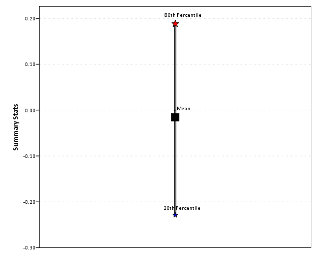
for a range of values, is it possible to create a graph in spss displaying the mean, median, percentile points, i.e. like a graphical display of a table of results using a dot for the mean, a star for the median etc? I appreciate your help, thank you. |
|
Here is a quick example - are you sure you don't just want a box plot?
|
|
hello all,
had the chance to try Andy's example, and it helped a lot. I do not execute a program to generate my variables, I have an active dataset, and I also want the statistics to be displayed horizontally, not vertically. So, I modified the example a bit and ended-up with the following which is what I want, and I'm pasting here for the forum. For the scale variable "difference" and the categorical variable "samples", I get the mean, median, max, min, and percentiles 10th, 25th, 75th and 90th, displayed horizontally for each level of "samples". GGRAPH /GRAPHDATASET NAME="sumdata" VARIABLES = samples GPTILE(difference, 90)[NAME = Per90"] GPTILE(difference, 75)[NAME = "Per75"] GPTILE(difference, 25)[NAME = "Per25"] GPTILE(difference, 10)[NAME = "Per10"] MEAN(difference)[NAME = "Mean_difference"] MEDIAN(difference)[NAME = "Median_difference"] MAXIMUM(difference)[NAME = "max_difference"] MINIMUM(difference)[NAME = "min_difference"] MISSING=LISTWISE REPORTMISSING=NO /GRAPHSPEC SOURCE=INLINE. BEGIN GPL SOURCE: sumdata=userSource(id("sumdata")) DATA: samples=col(source(sumdata), name("samples"), unit.category()) DATA: Per90=col(source(sumdata), name("Per90")) DATA: Per75=col(source(sumdata), name("Per75")) DATA: Per25=col(source(sumdata), name("Per25")) DATA: Per10=col(source(sumdata), name("Per10")) DATA: Mean_difference=col(source(sumdata), name("Mean_difference")) DATA: Median_difference=col(source(sumdata), name("Median_difference")) DATA: max_difference=col(source(sumdata), name("max_difference")) DATA: min_difference=col(source(sumdata), name("min_difference")) GUIDE: axis(dim(1), label("difference")) GUIDE: axis(dim(2), label("samples")) SCALE: linear(dim(1), min(40), max(1594)) ELEMENT: point(position(Per90*samples), color(color.red), size(size."15"), label("90th"), shape(shape.star)) ELEMENT: point(position(Per75*samples), color(color.blue), size(size."12"), label("75th"), shape(shape.star)) ELEMENT: point(position(Per25*samples), color(color.white), size(size."10"), label("25th"), shape(shape.star)) ELEMENT: point(position(Per10*samples), color(color.yellow), size(size."7"), label("10th"), shape(shape.star)) ELEMENT: point(position(Mean_difference*samples), color(color.black), size(size."12"), label("Mean"), shape(shape.square)) ELEMENT: point(position(Median_difference*samples), color(color.green), size(size."12"), label("Median"), shape(shape.square)) ELEMENT: point(position(max_difference*samples), color(color.black), size(size."12"), label("max"), shape(shape.triangle)) ELEMENT: point(position(min_difference*samples), color(color.black), size(size."12"), label("min"), shape(shape.triangle)) END GPL. Thank you for your help |
«
Return to SPSSX Discussion
|
1 view|%1 views
| Free forum by Nabble | Edit this page |


