graphing results of post-hoc pairwise comparisons
graphing results of post-hoc pairwise comparisons
|
Hello fellow SPSS users!
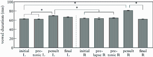
I have searched for this information everywhere but could not find anything of much help and I'd appreciate any advice. How do you show the results of post-hoc pairwise comparisons (i.e. significant group differences) on bar charts with means, like in the example chart attached below? Do I need an R plugin for this or is this function accessible directly in SPSS? If not, what is the procedure for using the R plugin? I'd be grateful for all your help. Thanks in advance! 
|
Re: graphing results of post-hoc pairwise comparisons
|
The way that I know of showing a concise summary of results of post-hoc
tests uses a list of the ordered means. For your chart, I see (approximately) 1 2 8 5 4 6 3 7 as the increasing order of the means, when numbered 1-8. Then you underline (1 2 8 5) to show that they "do not differ"; and you underline (5 4 6) to show that they "do not differ". Other contrasts "differ". SPSS Oneway used to provide a version of this for independent means (not for repeated measures). (Does Oneway still exist? features available?) The main body of theory for post-hocs is devoted to the example of independent means. Adapting that thought and theory to correlated means is still an iffy business, whether you find a reference or do-it-yourself. KISS ought to apply. Your chart is very hard to read, and it would be harder to read if it were complete. If your post-hocs are computed as separate t-tests because of unequal errors, then you need the table-matrix of contrasts, 8x8, which I think SPSS provided for Oneway ANOVA. Separate, paired-t's are often recommended for repeated errors owing to the difference in errors that frequently results from varying correlations. That might also want a matrix, if you consider all the contrasts to be interesting, I don't think that the option you ask for is something needed. -- Rich Ulrich > Date: Sun, 10 Feb 2013 05:27:40 -0800 > From: [hidden email] > Subject: graphing results of post-hoc pairwise comparisons > To: [hidden email] > > Hello fellow SPSS users! > > I have searched for this information everywhere but could not find anything > of much help and I'd appreciate any advice. > > How do you show the results of post-hoc pairwise comparisons (i.e. > significant group differences) on bar charts with means, like in the example > chart attached below? Do I need an R plugin for this or is this function > accessible directly in SPSS? If not, what is the procedure for using the R > plugin? > > I'd be grateful for all your help. Thanks in advance! > <http://spssx-discussion.1045642.n5.nabble.com/file/n5718016/post-hoc.gif> > > |
Re: graphing results of post-hoc pairwise comparisons
|
Help > Command Syntax Reference ONEWAY is on page 1441: PLOT MEANS is on page 1467. John F Hall (Mr) [retired academic survey researcher] Email: [hidden email] Website: www.surveyresearch.weebly.com From: SPSSX(r) Discussion [mailto:[hidden email]] On Behalf Of Rich Ulrich The way that I know of showing a concise summary of results of post-hoc > Date: Sun, 10 Feb 2013 05:27:40 -0800 |
| Free forum by Nabble | Edit this page |

