setWrapPanel from GUI
|
I am studying the example from this page:
http://www.ats.ucla.edu/stat/spss/examples/alda/chapter2/aldaspssch2.htm and trying to re-create this graph: 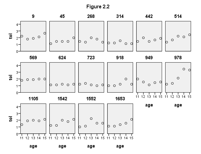 However I am not sure how the syntax is generated using GUI? In particular the setWrapPanel specification? GGRAPH /GRAPHDATASET NAME="GraphDataset" VARIABLES= tol age id /GRAPHSPEC SOURCE=INLINE INLINETEMPLATE=[ "<setWrapPanels/>"]. BEGIN GPL SOURCE: s=userSource( id( "GraphDataset" ) ) DATA: tol=col( source(s), name( "tol" ) ) DATA: age=col( source(s), name( "age" ) ) DATA: id=col( source(s), name( "id" ), unit.category() ) GUIDE: text.title( label( "Figure 2.2" ) ) GUIDE: axis( dim( 1 ), label( "age" ) ) GUIDE: axis( dim( 2 ), label( "tol" ) ) GUIDE: axis( dim( 3 ), label( "id" ), opposite() ) SCALE: linear( dim( 1 ), min( 11 ), max( 15 ) ) SCALE: linear( dim( 2 ), min( 0 ), max( 4 ) ) ELEMENT: point( position( summary.mode( age * tol * id ) ) ) END GPL. Many thanks in advance. Jignesh |
|
You can specify wrapped panels for small multiples within inline GPL - very useful when the number of panels is large. If my memory is correct, if you insert below anywhere within the inline GPL it will make the panels wrap.
COORD: rect(dim(1,2), wrap()) This can be added via the GUI in the chart builder dialogue. |
|
Where exactly in the GUI of Chart Builder would this be found? I couldn't locate it..
|
|
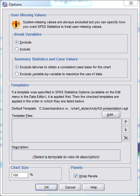
Yeah it is buried a bit. If you open up the Chart Builder GUI (Graphs -> Chart Builder) then click the "Options" button (below the "Element Properties" button) it is in that window. See towards the bottom of this image.
|
|
Hi Andy, sorry maybe I'm being a numpty here...but simply click that doesn't result in anything meaningful? After selecting that where/how do I specify that the panels are to be split by ID
Heres the steps I am taking 1) Scatter/Dot 2) Simple Scatter 3) X-axis = age (as nominal) 4) Y-axis = tol (as nominal) Where then do I specify the set wrap panel requirements to split by ID? |
|
When you know how to edit the syntax I personally don't find much utility in knowing how to navigate the GUI, but here you go.
1: Open the chart builder GUI 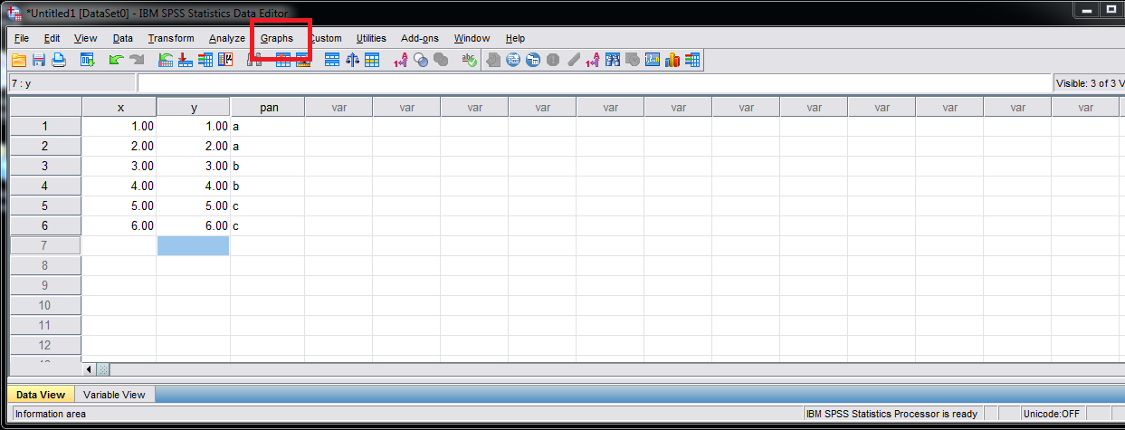 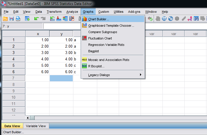 2: Specify the stuff that goes on the x and y axis for your graph. Here I use a scatterplot 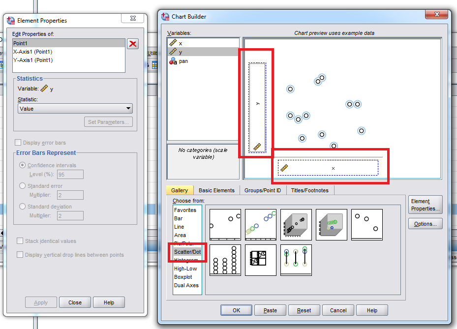 3: now click the tab named "Group/Point ID" below the open chart canvas. Then pick the variable you want to use to define the panels. This should be a categorical variable (it does not matter if you use row or column panels) 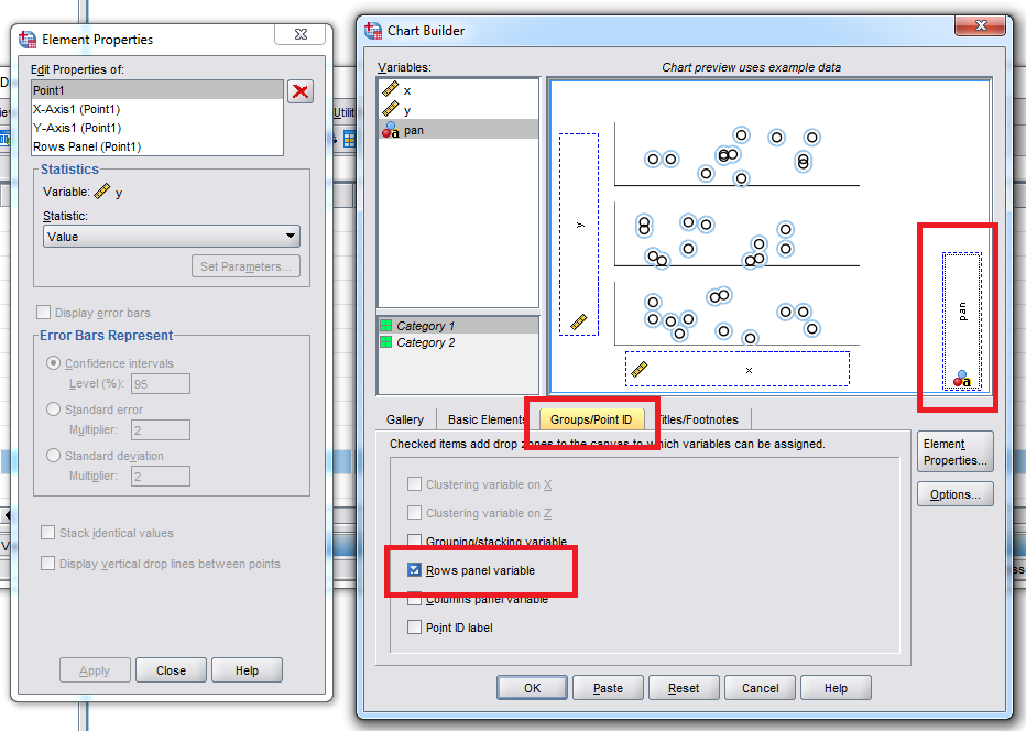
4: Now click the options button I mentioned earlier, and then select the "Wrap Panels" option. Click OK. 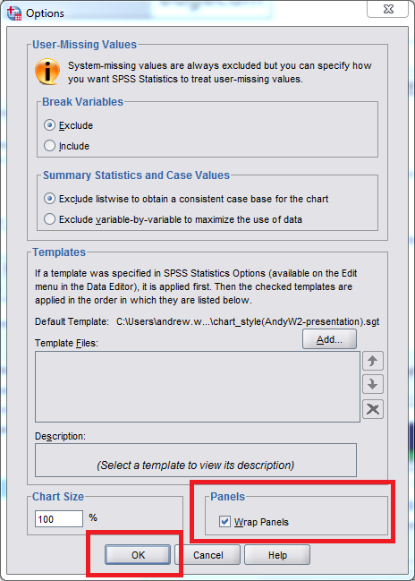 5: now you can either click OK in the main Chart builder GUI to generate the chart, or click "Paste" to paste the syntax. Here is what the pasted syntax looks like for this example. * Chart Builder. GGRAPH /GRAPHDATASET NAME="graphdataset" VARIABLES=x[LEVEL=SCALE] y[LEVEL=SCALE] pan MISSING=LISTWISE REPORTMISSING=NO /GRAPHSPEC SOURCE=INLINE. BEGIN GPL SOURCE: s=userSource(id("graphdataset")) DATA: x=col(source(s), name("x")) DATA: y=col(source(s), name("y")) DATA: pan=col(source(s), name("pan"), unit.category()) COORD: rect(dim(1,2), wrap()) GUIDE: axis(dim(1), label("x")) GUIDE: axis(dim(2), label("y")) GUIDE: axis(dim(4), label("pan"), opposite()) ELEMENT: point(position(x*y*1*pan)) END GPL. |
|
Brilliant thanks. Sorry to make you get the screen grabs for that, much appreciated.
It's good to know how to do it via GUI to get the initial syntax template and then be able to modify from there as necessary. Many thanks again. |
«
Return to SPSSX Discussion
|
1 view|%1 views
| Free forum by Nabble | Edit this page |

