Re: AW: 'Forest-plots' or Errror bar-charts in SPSS
Posted by Andy W on
URL: http://spssx-discussion.165.s1.nabble.com/Forest-plots-or-Errror-bar-charts-in-SPSS-tp1070926p5734636.html
The code is alittle confusing, as it had a transpose of a transpose. So if you eliminated the inner transpose on the COORD statement you get the studies on the Y axis. Here are a few more updates I would do that plot as well.
GGRAPH
/GRAPHDATASET NAME="graphdataset" VARIABLES=YearAndStudy ciup cilow measure percwi RefLine
MISSING=LISTWISE REPORTMISSING=NO
/GRAPHSPEC SOURCE=INLINE.
BEGIN GPL
SOURCE: s=userSource(id("graphdataset"))
DATA: YearAndStudy=col(source(s), name("YearAndStudy"), unit.category())
DATA: ciup=col(source(s), name("ciup"))
DATA: cilow=col(source(s), name("cilow"))
DATA: measure=col(source(s), name("measure"))
DATA: percwi=col(source(s), name("percwi"))
DATA: RefLine=col(source(s), name("RefLine"))
COORD: transpose(rect(dim(1,2)))
GUIDE: text.title(label("<- Favours treatment | Favours Control ->"))
GUIDE: axis(dim(2))
GUIDE: form.line(position(*,1), color(color.grey))
GUIDE: legend(aesthetic(aesthetic.size), null())
SCALE: cat(dim(1), reverse())
SCALE: log(dim(2), base(2))
SCALE: pow(aesthetic(aesthetic.size), aestheticMinimum(size."4px"), aestheticMaximum(size."16px"))
ELEMENT: interval(position(region.spread.range(YearAndStudy*(cilow+ciup))),
shape(shape.line), color(color.black))
ELEMENT: point(position(YearAndStudy*measure), shape(shape.square),
size(percwi), color.interior(color.black))
END GPL.
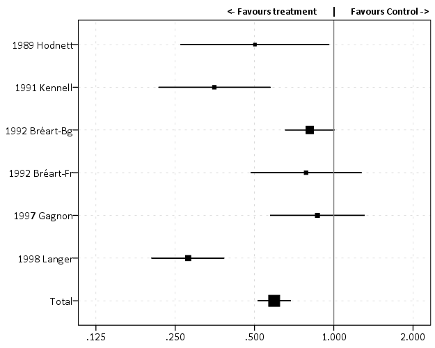
I edited the title to line up appropriately, but the rest is simply via the look of my chart template. Those few updates to Marta's code include:
- studies on Y axis
- studies sorted so older are at the top, newer and total at the bottom
- X axis uses log base 2
- used a GUIDE for the reference line, instead of a variable (the form.line makes it go through the whole graph is the only real difference)
- the guide line at 1 is light grey and plotted behind the data
- squares are plotted on square root scale, so it is associated with the area of the square, not its edge size
- eliminate the legend for the square sizes
- made the favours treatment a title instead of axis label
URL: http://spssx-discussion.165.s1.nabble.com/Forest-plots-or-Errror-bar-charts-in-SPSS-tp1070926p5734636.html
The code is alittle confusing, as it had a transpose of a transpose. So if you eliminated the inner transpose on the COORD statement you get the studies on the Y axis. Here are a few more updates I would do that plot as well.
GGRAPH
/GRAPHDATASET NAME="graphdataset" VARIABLES=YearAndStudy ciup cilow measure percwi RefLine
MISSING=LISTWISE REPORTMISSING=NO
/GRAPHSPEC SOURCE=INLINE.
BEGIN GPL
SOURCE: s=userSource(id("graphdataset"))
DATA: YearAndStudy=col(source(s), name("YearAndStudy"), unit.category())
DATA: ciup=col(source(s), name("ciup"))
DATA: cilow=col(source(s), name("cilow"))
DATA: measure=col(source(s), name("measure"))
DATA: percwi=col(source(s), name("percwi"))
DATA: RefLine=col(source(s), name("RefLine"))
COORD: transpose(rect(dim(1,2)))
GUIDE: text.title(label("<- Favours treatment | Favours Control ->"))
GUIDE: axis(dim(2))
GUIDE: form.line(position(*,1), color(color.grey))
GUIDE: legend(aesthetic(aesthetic.size), null())
SCALE: cat(dim(1), reverse())
SCALE: log(dim(2), base(2))
SCALE: pow(aesthetic(aesthetic.size), aestheticMinimum(size."4px"), aestheticMaximum(size."16px"))
ELEMENT: interval(position(region.spread.range(YearAndStudy*(cilow+ciup))),
shape(shape.line), color(color.black))
ELEMENT: point(position(YearAndStudy*measure), shape(shape.square),
size(percwi), color.interior(color.black))
END GPL.
I edited the title to line up appropriately, but the rest is simply via the look of my chart template. Those few updates to Marta's code include:
- studies on Y axis
- studies sorted so older are at the top, newer and total at the bottom
- X axis uses log base 2
- used a GUIDE for the reference line, instead of a variable (the form.line makes it go through the whole graph is the only real difference)
- the guide line at 1 is light grey and plotted behind the data
- squares are plotted on square root scale, so it is associated with the area of the square, not its edge size
- eliminate the legend for the square sizes
- made the favours treatment a title instead of axis label
| Free forum by Nabble | Edit this page |