Addition of line in GGRAPH?
|
As it seems, I will have to make some more or less manual additions to scatterplots set up with GGRAPH, namely two regression lines each representing one subgroup. Is there any way to tell the GGRAPH that I want to add these? Something like ELEMENT: line(response=3.2+1.7*predictor) would be nice.
Or are there smarter ways? The basic task is to set up regression models with an interaction term between time and subgroup: UNIANOVA bmi BY county WITH age screening_nr /DESIGN=county age screening_nr county*screening_nr followed by a scatter plot of bmi vs screening_nr where I would like to add one regression line for each county. Parallel lines would indicate an interaction between time(screening_nr) and county. Suggestions for one or both of these questions? Robert ===================== To manage your subscription to SPSSX-L, send a message to [hidden email] (not to SPSSX-L), with no body text except the command. To leave the list, send the command SIGNOFF SPSSX-L For a list of commands to manage subscriptions, send the command INFO REFCARD
Robert Lundqvist
|
|
Administrator
|
Hi Robert. You can find relevant examples on this page:
http://www.ats.ucla.edu/stat/spss/library/ggraph_examples.htm HTH.
--
Bruce Weaver bweaver@lakeheadu.ca http://sites.google.com/a/lakeheadu.ca/bweaver/ "When all else fails, RTFM." PLEASE NOTE THE FOLLOWING: 1. My Hotmail account is not monitored regularly. To send me an e-mail, please use the address shown above. 2. The SPSSX Discussion forum on Nabble is no longer linked to the SPSSX-L listserv administered by UGA (https://listserv.uga.edu/). |
|
In reply to this post by Robert L
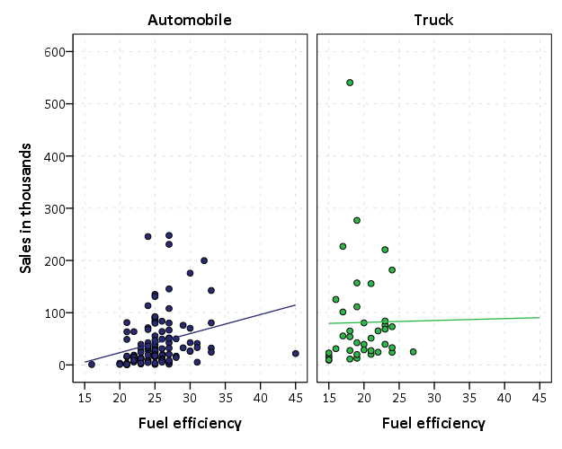
Well, the issue here is the second control variable age. So if you just had the regression design with the one categorical variable and the one continuous variable, you could make the regression line by groups right in GPL.
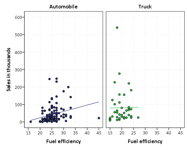
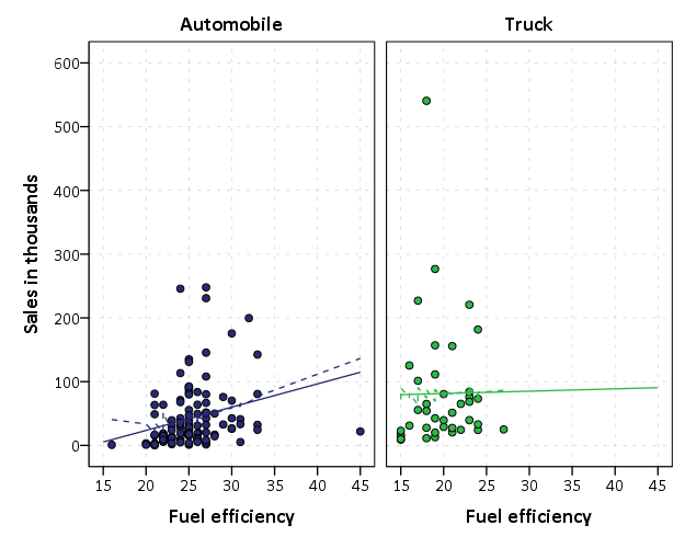
Here is an example using a car sales dataset that comes with SPSS. ******************************************************************. FILE HANDLE data /NAME = "C:\Program Files\IBM\SPSS\Statistics\24\Samples\English". GET FILE = "data\car_sales.sav". DATASET NAME car_sales. FORMATS sales (F3.0). GGRAPH /GRAPHDATASET NAME="graphdataset" VARIABLES=mpg sales type MISSING=LISTWISE REPORTMISSING=NO /GRAPHSPEC SOURCE=INLINE. BEGIN GPL SOURCE: s=userSource(id("graphdataset")) DATA: mpg=col(source(s), name("mpg")) DATA: sales=col(source(s), name("sales")) DATA: type=col(source(s), name("type"), unit.category()) COORD: rect(dim(1,2), wrap()) GUIDE: axis(dim(1), label("Fuel efficiency")) GUIDE: axis(dim(2), label("Sales in thousands")) GUIDE: axis(dim(3), opposite()) GUIDE: legend(aesthetic(aesthetic.color.interior), null()) SCALE: cat(aesthetic(aesthetic.color.exterior), include("0", "1")) ELEMENT: point(position(mpg*sales*type), color.interior(type)) ELEMENT: line(position(smooth.linear(mpg*sales*type)), color.interior(type)) END GPL. ******************************************************************.  It would also be equivalent to predict the values following the regression, and then plot those predicted values as a line in the plot. See this code. ******************************************************************. *Is equivalent to. UNIANOVA sales BY type WITH mpg /DESIGN=type mpg type*mpg /SAVE PRED(Pred1). GGRAPH /GRAPHDATASET NAME="graphdataset" VARIABLES=mpg sales type Pred1 MISSING=LISTWISE REPORTMISSING=NO /GRAPHSPEC SOURCE=INLINE. BEGIN GPL SOURCE: s=userSource(id("graphdataset")) DATA: mpg=col(source(s), name("mpg")) DATA: sales=col(source(s), name("sales")) DATA: type=col(source(s), name("type"), unit.category()) DATA: Pred1=col(source(s), name("Pred1")) COORD: rect(dim(1,2), wrap()) GUIDE: axis(dim(1), label("Fuel efficiency")) GUIDE: axis(dim(2), label("Sales in thousands")) GUIDE: axis(dim(3), opposite()) GUIDE: legend(aesthetic(aesthetic.color.interior), null()) SCALE: cat(aesthetic(aesthetic.color.exterior), include("0", "1")) ELEMENT: point(position(mpg*sales*type), color.interior(type)) ELEMENT: line(position(mpg*Pred1*type), color.interior(type)) END GPL. ******************************************************************.  Well it is not exactly the same, the line only goes within the domain of the observed X values instead of spanning the whole plot. The issue though is with the second control variable. The fit line on the scatterplot will not be the same once you insert another control variable. You will need something like a partial regression plot, https://en.wikipedia.org/wiki/Partial_regression_plot. Here is an illustration of the problem. ******************************************************************. *Not the same though. UNIANOVA sales BY type WITH mpg engine_s /DESIGN=type mpg type*mpg engine_s /SAVE PRED(Pred2). FORMATS Pred2 (F3.0). GGRAPH /GRAPHDATASET NAME="graphdataset" VARIABLES=mpg sales type Pred2 MISSING=LISTWISE REPORTMISSING=NO /GRAPHSPEC SOURCE=INLINE. BEGIN GPL SOURCE: s=userSource(id("graphdataset")) DATA: mpg=col(source(s), name("mpg")) DATA: sales=col(source(s), name("sales")) DATA: type=col(source(s), name("type"), unit.category()) DATA: Pred2=col(source(s), name("Pred2")) COORD: rect(dim(1,2), wrap()) GUIDE: axis(dim(1), label("Fuel efficiency")) GUIDE: axis(dim(2), label("Sales in thousands")) GUIDE: axis(dim(3), opposite()) GUIDE: legend(aesthetic(aesthetic.color.interior), null()) SCALE: cat(aesthetic(aesthetic.color.exterior), include("0", "1")) ELEMENT: point(position(mpg*sales*type), color.interior(type)) ELEMENT: line(position(smooth.linear(mpg*sales*type)), color.interior(type)) ELEMENT: line(position(mpg*Pred2*type), color.interior(type), shape(shape.dash)) END GPL. ******************************************************************.  |
«
Return to SPSSX Discussion
|
1 view|%1 views
| Free forum by Nabble | Edit this page |

