Can't get clustered bar chart
|
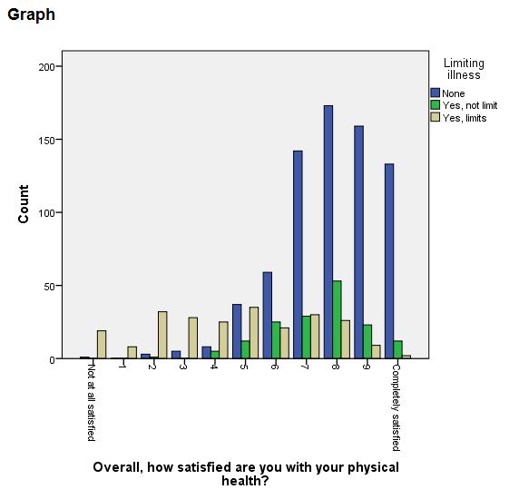
I'm having troubled producing a clustered barchart from the Chartbuilder. I have two variables, satisfaction with physical health (0-10 scale) and LIMIT (a 3-point level of health limitation). I can make one with GRAPH
graph /bar (grouped) = mcz_5b by limit.
(but I can't find a way to display as percentages rather than counts: nothing in the FM)
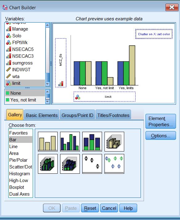
 When I try to use Chartbuilder to do the same thing I can't get past defining the two axes to PASTE or OK. If I add LIMIT to the cluster in the top right, I get OK and PASTE, but the chart comes out like this.
 What am I doing wrong?
|
|
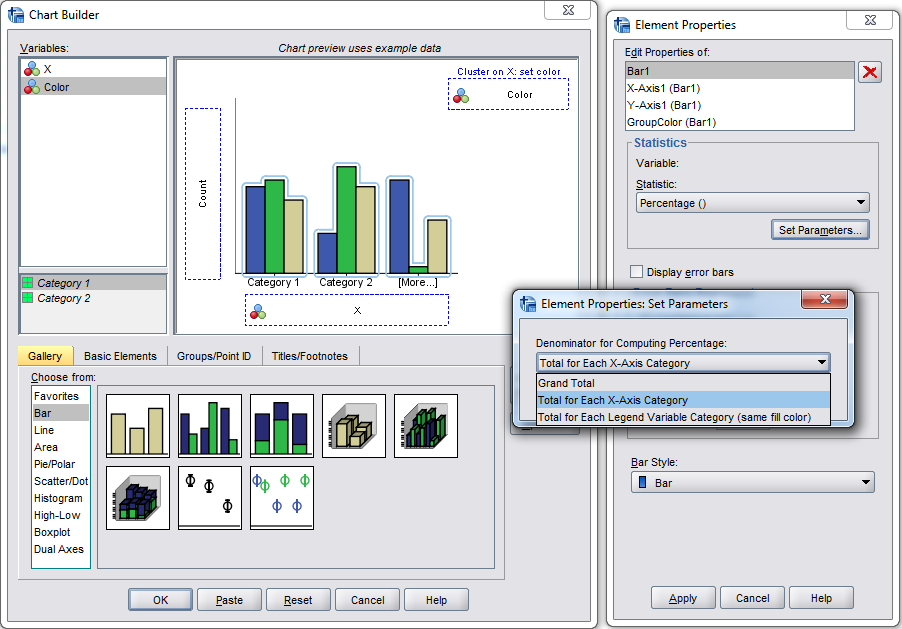
From your description it sounds like you want to drag "mcz_5b" to the x-axis and "limit" to the cluster on x box at the top right. Then it will default to count on the Y axis, which can be edited to change it to different percents. See below:
 Applying the changes in the screenshot and pasting the syntax (for that example) results in the GGRAPH code below: ********************************************. DATA LIST FREE / X Color. BEGIN DATA 1 1 1 1 1 2 2 2 2 2 2 1 3 1 3 2 3 3 END DATA. DATASET NAME Test. DATASET ACTIVATE Test. * Chart Builder. GGRAPH /GRAPHDATASET NAME="graphdataset" VARIABLES=X COUNT()[name="COUNT"] Color MISSING=LISTWISE REPORTMISSING=NO /GRAPHSPEC SOURCE=INLINE. BEGIN GPL SOURCE: s=userSource(id("graphdataset")) DATA: X=col(source(s), name("X"), unit.category()) DATA: COUNT=col(source(s), name("COUNT")) DATA: Color=col(source(s), name("Color"), unit.category()) COORD: rect(dim(1,2), cluster(3,0)) GUIDE: axis(dim(3), label("X")) GUIDE: axis(dim(2), label("Percent")) GUIDE: legend(aesthetic(aesthetic.color.interior), label("Color")) SCALE: linear(dim(2), include(0)) ELEMENT: interval(position(summary.percent(Color*COUNT*X, base.coordinate(dim(3)))), color.interior(Color), shape.interior(shape.square)) END GPL. ********************************************. |
Re: Can't get clustered bar chart
|
In reply to this post by John F Hall
Drag your satisfaction variable to the x-axis and your limit variable to the Cluster on X box. You set the statistic via the properties of the element in the element Properties dialog box. Select percentage and then specify the base for the percentage (grand total, within legend of within x-axis category. Note also that level of measurement controls what statistics you can ask for. Make sure that satisfaction variable is NOT interval. From: SPSSX(r) Discussion [mailto:[hidden email]] On Behalf Of John F Hall I'm having troubled producing a clustered barchart from the Chartbuilder. I have two variables, satisfaction with physical health (0-10 scale) and LIMIT (a 3-point level of health limitation). I can make one with GRAPH graph /bar (grouped) = mcz_5b by limit. (but I can't find a way to display as percentages rather than counts: nothing in the FM) View this message in context: Can't get clustered bar chart |
| Free forum by Nabble | Edit this page |


 When I try to use Chartbuilder to do the same thing I can't get past defining the two axes to PASTE or OK. If I add LIMIT to the cluster in the top right, I get OK and PASTE, but the chart comes out like this.
  What am I doing wrong?